This summer, I worked as a User Experience Design Intern at Spectrum Reach’s UX Design Team. I had the opportunity to lead user research into their internal sales tools and re-design a feature UI which went under production. Together with another interns, we led the redesign of the AdsEverywhere product, where I led design of a mobile client-reporting tool that helps our customers to keep track of their advertisement campaigns.
Overall, it was a phenomenal experience. I learnt much more beyond UX Design!
Duration : 11 weeks
Role: UX Research & UX Design
Type: Internship
About Spectrum Reach
Spectrum Reach is the advertising division of the Spectrum brand. They provide services for customers to place advertisement on Cable and Digital platforms. Spectrum is the trade name under which Charter Communications market consumer cable television, internet, telephone, and wireless services.
Charter Communications is a telecommunications and mass media company, providing services to over 26 million customers in 41 states, it is the second-largest cable operator in the United States by subscribers, just behind Comcast, and third largest pay TV operator behind Comcast and AT&T. It is the fifth largest telephone provider based upon residential subscriber line count.
Design Outcome
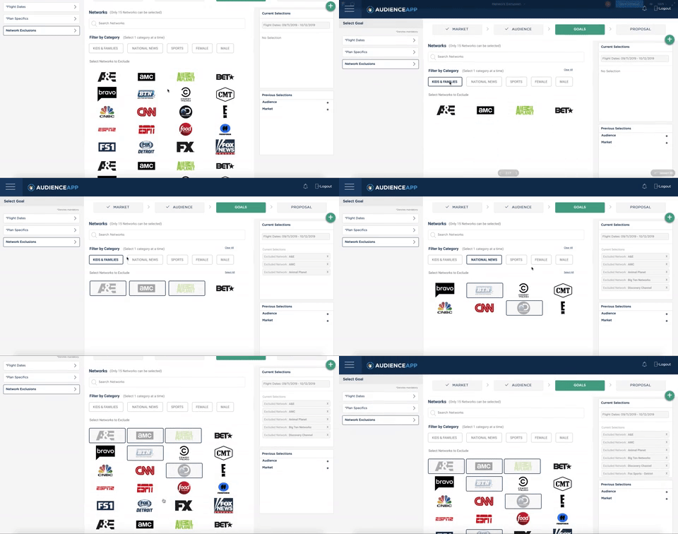
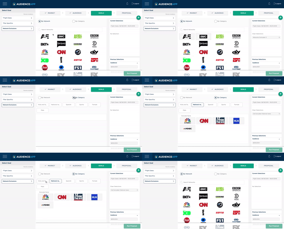
Network Exclusion UI & Functionality Re-design
Thoughts & Process
Prompt
Previous research concluded that our users would like to include category AND networks into client proposals rather than include categories OR networks. I was given the task to design an interface that promote both category and networks
Who are the users?
Our users included the current sales staff which are the account executives (AE) and the account planners (AP). After understanding the current sales process, I knew I had provide an interface which enables them to quickly input data and run proposals, as they have to stay on their toes while drafting the client proposals.
What were the constraints?
- I had a 2 week deadline in order to push the feature into production.
- Spectrum doesn’t cater to the Denver region, so I had to conduct remote user interviews.
- Due to time constraints, I had to follow the current “Select to Exclude” interaction. Which is counter-intuitive to how users select anything on a digital platform.
Understanding the current design and interaction
Since I had to work on 3 separate projects during the course of my internship, I used this opportunity to ask questions on the Network Exclusion after the main genesis of the interview was done. I gained good insights into the current sales process, which led my later design decisions.
I spoke with UX designers in my team who have worked on the application before to understand the workflow and whether there were any technical constraints I should be aware of.
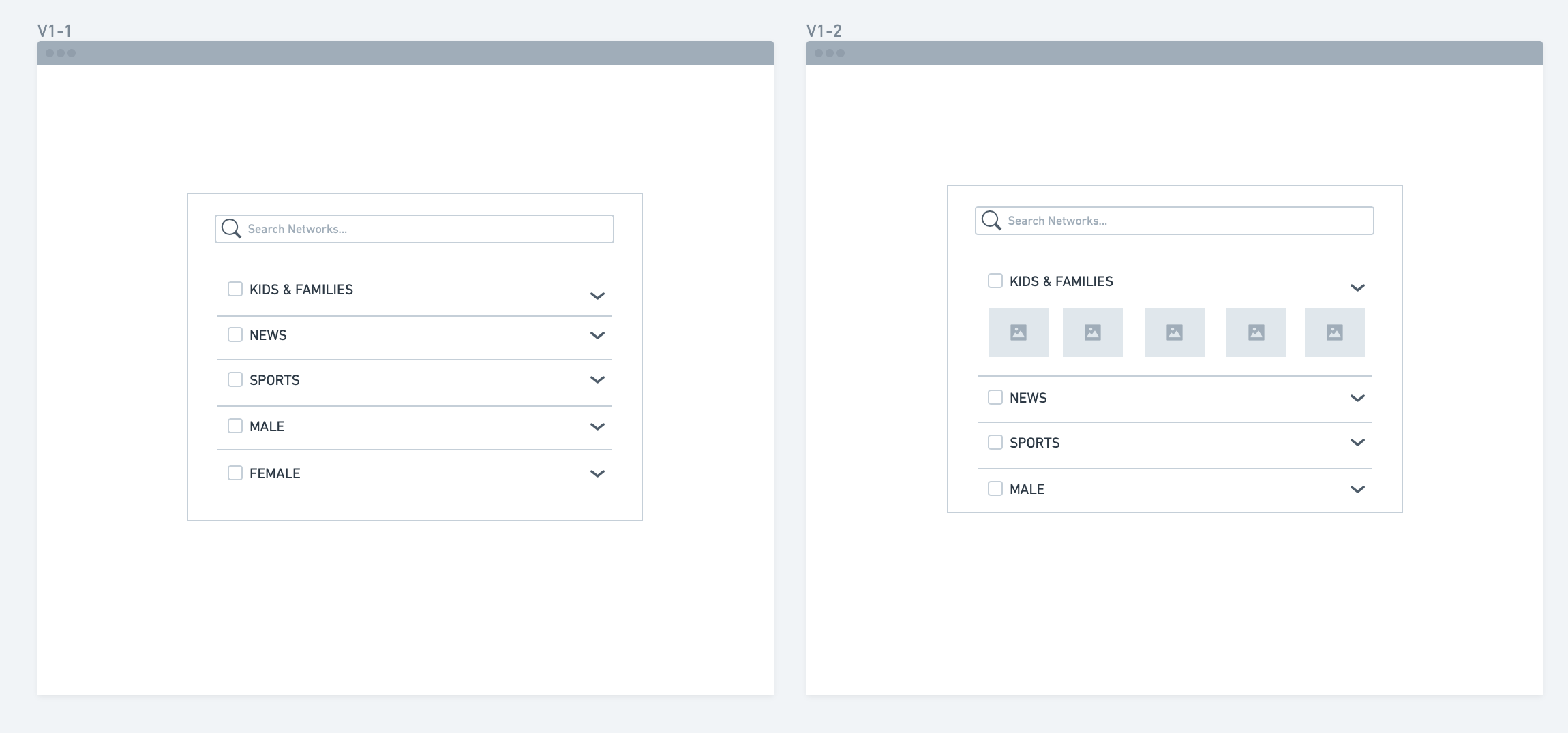
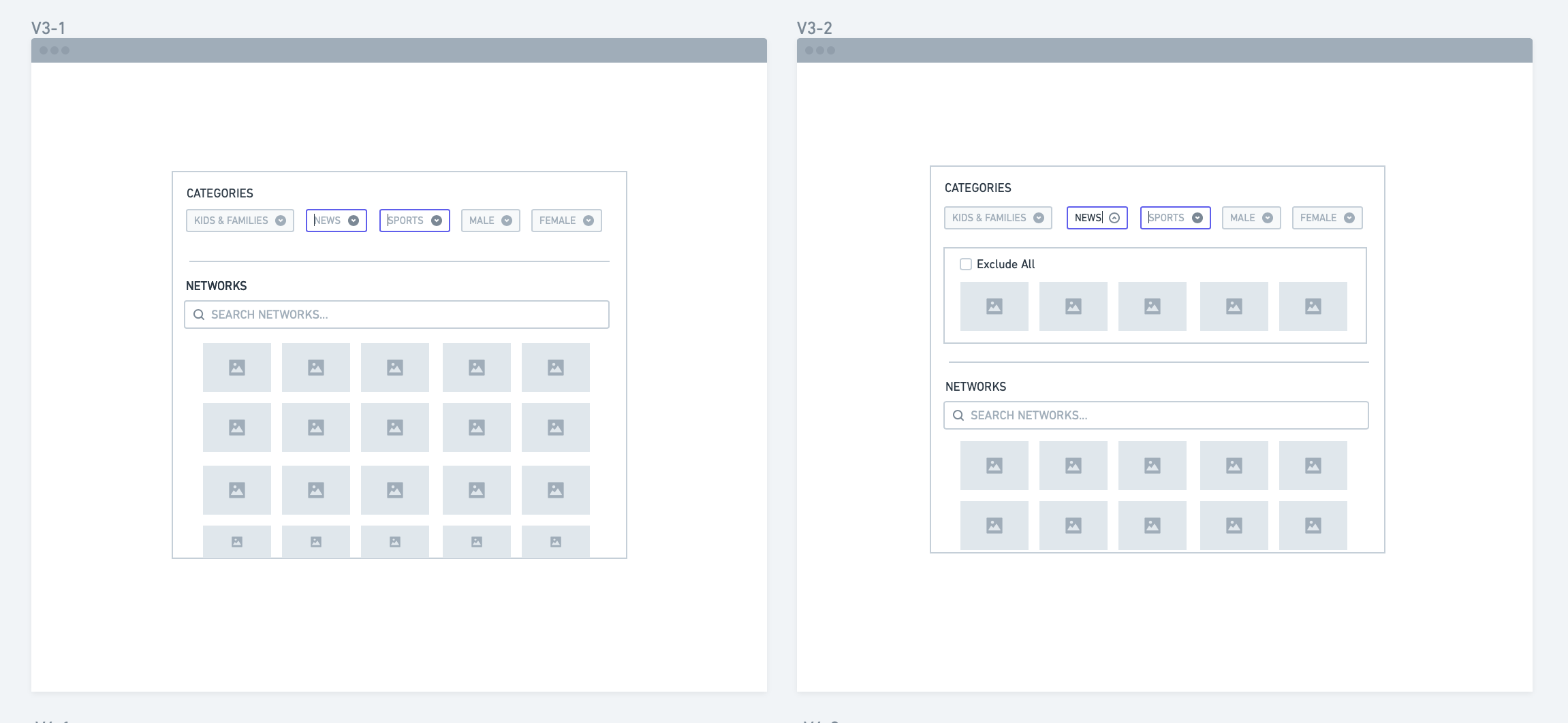
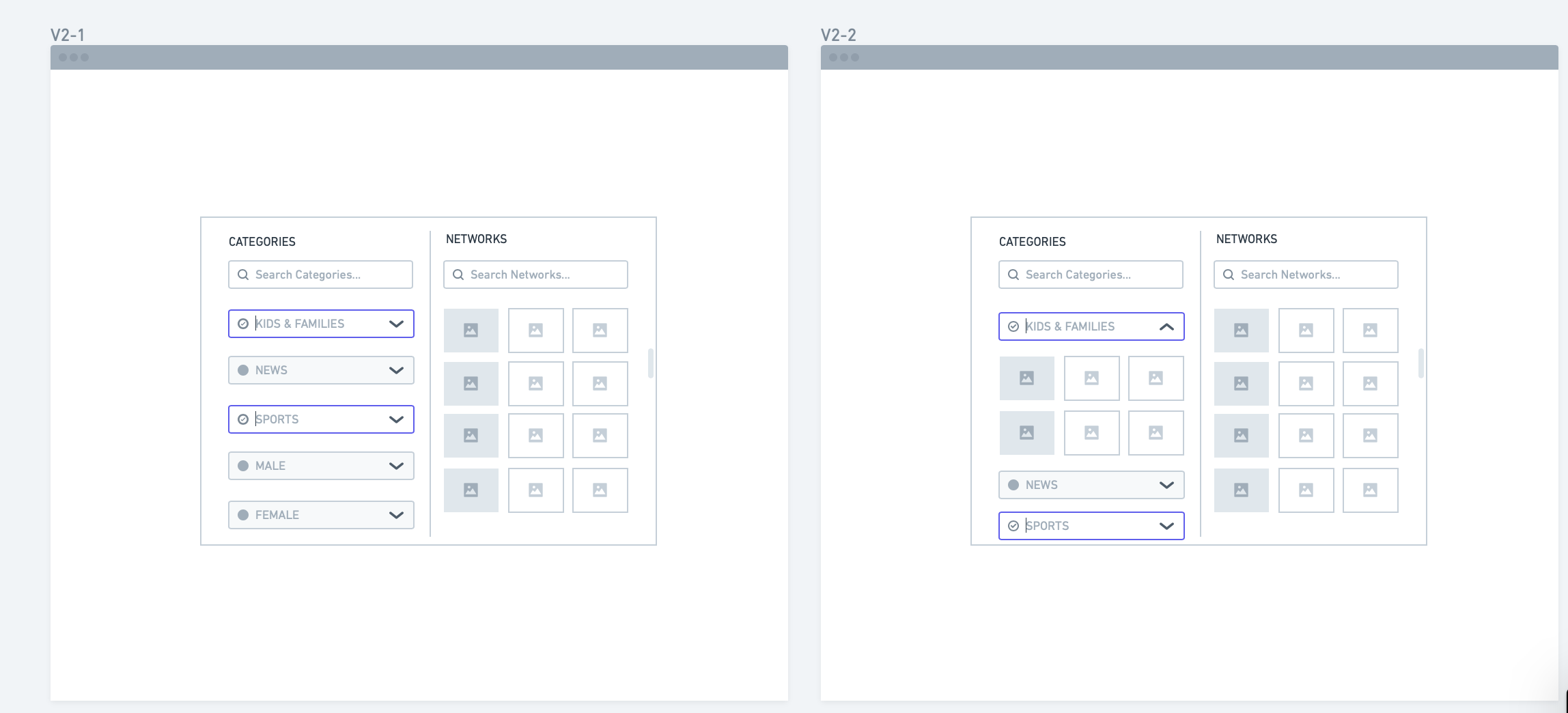
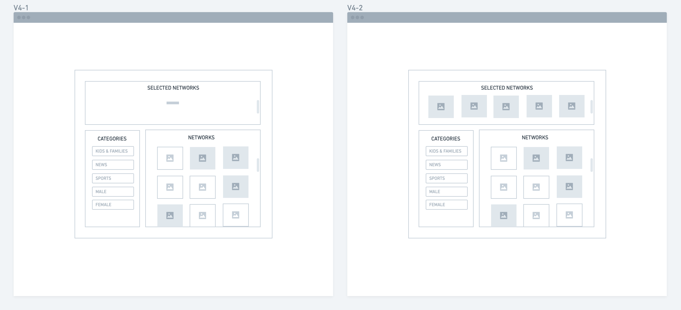
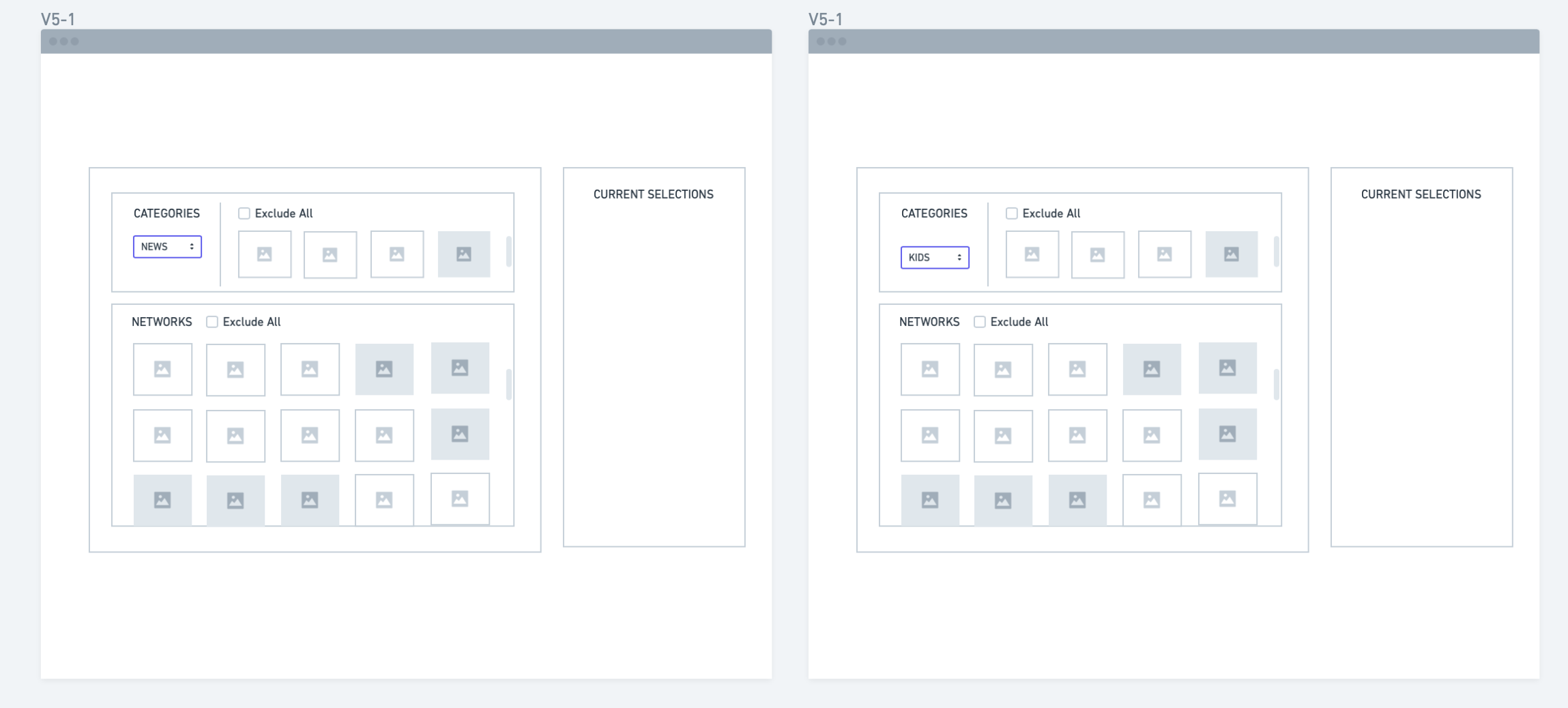
Initial wireframes and feedback
I had made 5 different design versions and subsequently asked for feedback with what works well with users.
Iterating designs based on feedback
Based on the feedback, it became clear that there was a disconnect in relation between the category and networks. Version 2 got the most positive feedback amongst others.
I decided to move forward with this design but introducing the idea of filters for categories. Essentially eliminating the need for a separate category tab.

What I think about this process
This was my first ever design which has gone into production, I feel extremely proud!
The feature re-design taught me the importance of feedback and iteration, I wouldn’t have conceptualized this design if it weren’t for that.
I presented the new design to my manager and the supporting leadership team, they appreciate the design and the work I put into it.
Overall, It was great to have the support and availability of the team. From asking question to scheduling time slots for design reviews, they always provide help whenever I asked for it.
