Social Netflix
Exploring how might we introduce social interaction in a video only platform
TL;DR
Role: UX and Interaction Designer
Tools: Sketch, Invision and Whimsical
Timeline: Jan 2019 – Feb 2019
As of 2018, Netflix has 149 mn subscribers.
With how social attributes govern users perspective on video content. I wanted to explore whether incorporating social tendencies increases the user base and a potential new video engagement platform.
Problem
According to metrics and studies conducted from the University of Texas at Austin and the University of Washington, Online Video platforms ranks high in binge-watching. An implication which affects the social behavioral tendencies of users, they tend to be more anti-social! But Netflix has also been credited in bringing friends and family together.
Solution
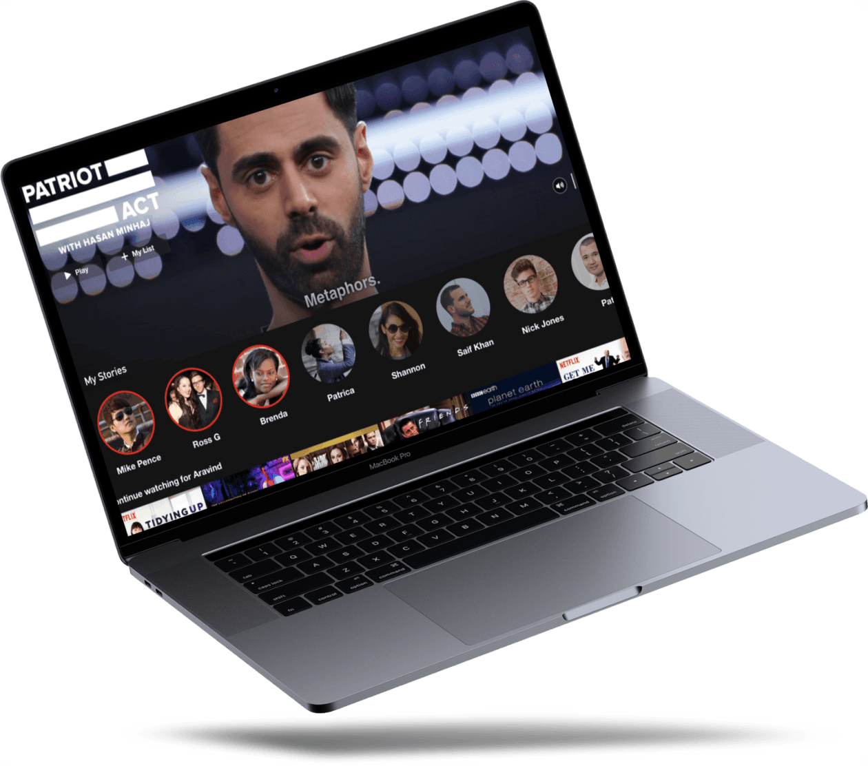
Social Netflix is Netflix with incorporated features which improves and triggers users to socialize with friends and family within the platform. It leverages current movie/shows interests and turns it into sociable events – driving interactions between users and promoting Netflix content. This application encourages users to place stories about current movie trends, watch content with friends and family and promote easier content sharing.
Design Outcome
Group Watch
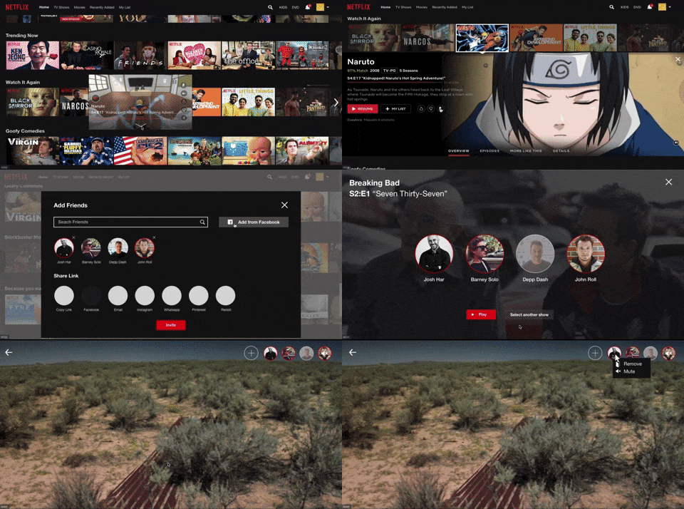
Enabling users to watch content with friends and families remotely/virtually.
Stories
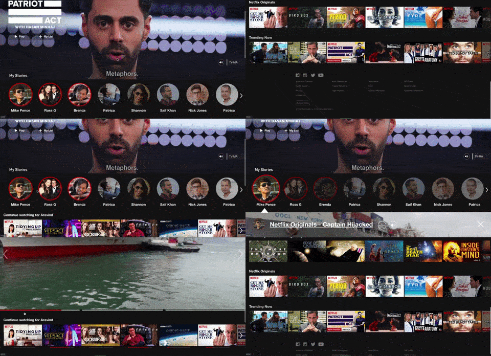
Place snippets of your shows or movies. Get informed about acclaimed movies or TV shows from friends and family.
In-House Sharing
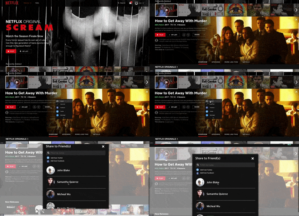
Enabling users to share content within the platform rather than using third party applications.
Understanding
Designing for the users requires us to learn the tendencies and habits of our target demographics. We conducted 10 interviews with our target users aged between 18-30. Our findings were concised into:
Content
Users get suggestion from friends or social media handles and the general tendency is to follow these suggestions.
Sharing
Content sharing is primarily done using 3rd part applications, there is no in-house sharing method. It is interesting to note that Netflix Desktop doesn’t have the option to share.
Viewing
Groups of friends tend to watch Netflix shows similar to how they watch movies in theaters. They plan it previously and execute that plan.
Product Visioning
After conducting our research, I decided to focus our attention on the high level insights. The features I decided to implement are:
User Stories
Users can post and see video previews as stories such that Netflix will be informed about acclaimed movies/tv shows from their peers rather than other medium.
Group Watch
Enabling users to watch content through a virtual box with their peers, promoting social interaction amongst them.
In-house Sharing
Enabling users to control how they share content within Netflix.
Design
User Stories
I decided to implement an activity cell which indicates the current state of the user’s actions. I’ve used a red border over the activity cell to indicate new activity.
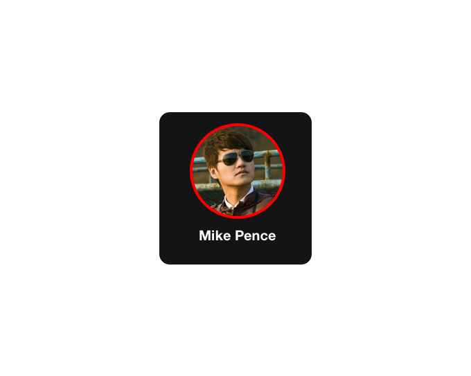
Active State
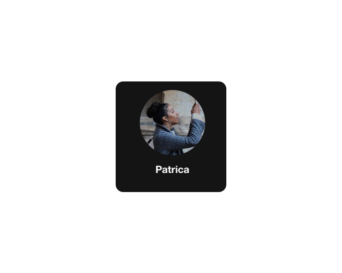
Inactive State
For Desktop,
I have implemented the user stories right below the main image placeholders, such that users can receive immediate information of content seen by their peers, potentially providing suggestions for content to stream.
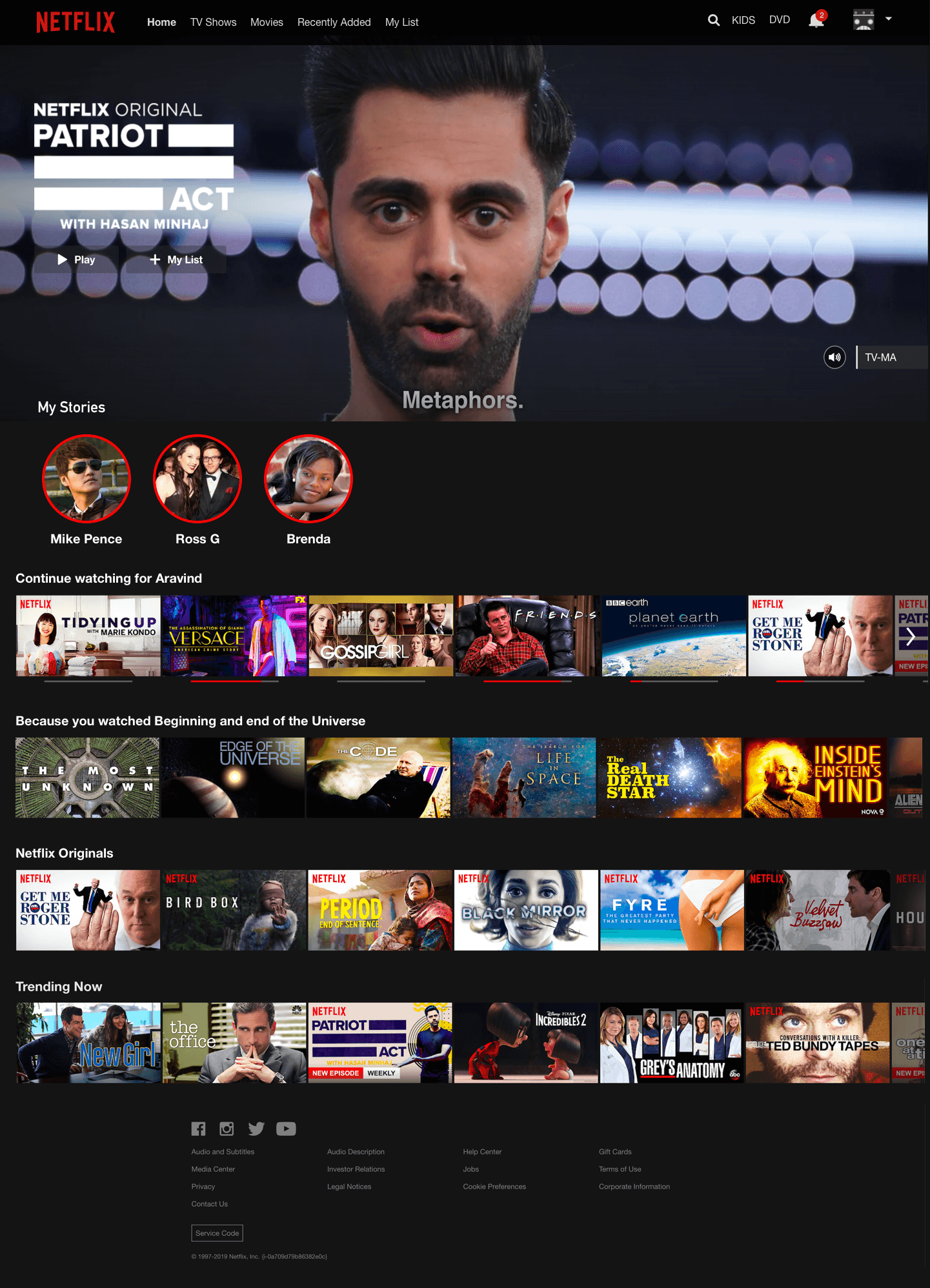
Designing for Single State
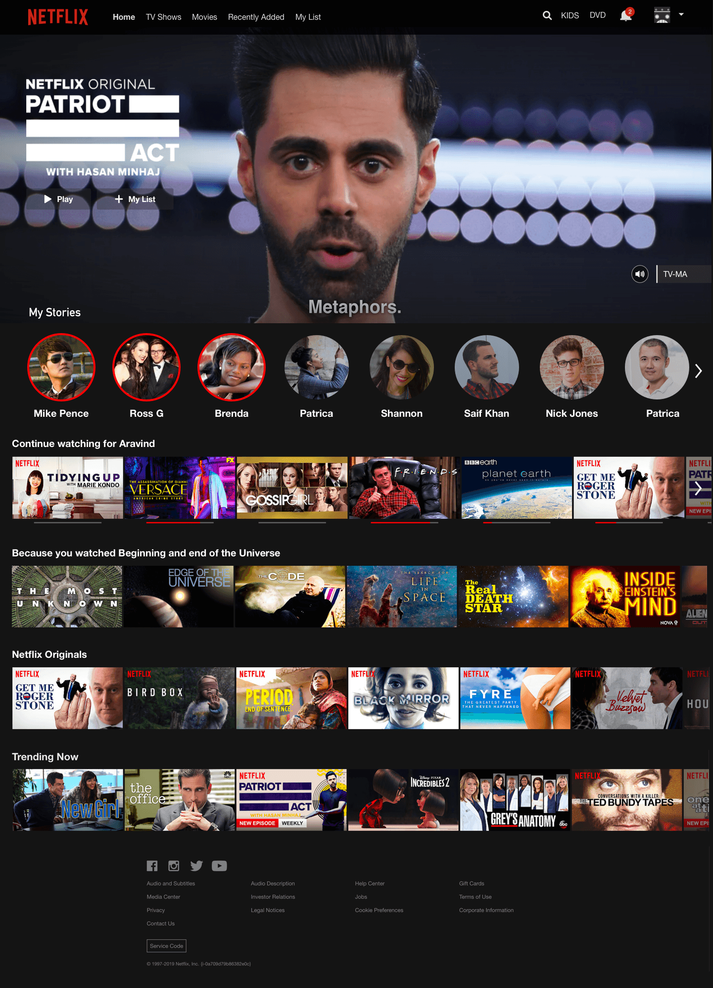
Designing for Many State
For viewing stories, I came up with 3 different layouts. Each layout supports a different interaction. It was necessary to review this with others to find the best fit.
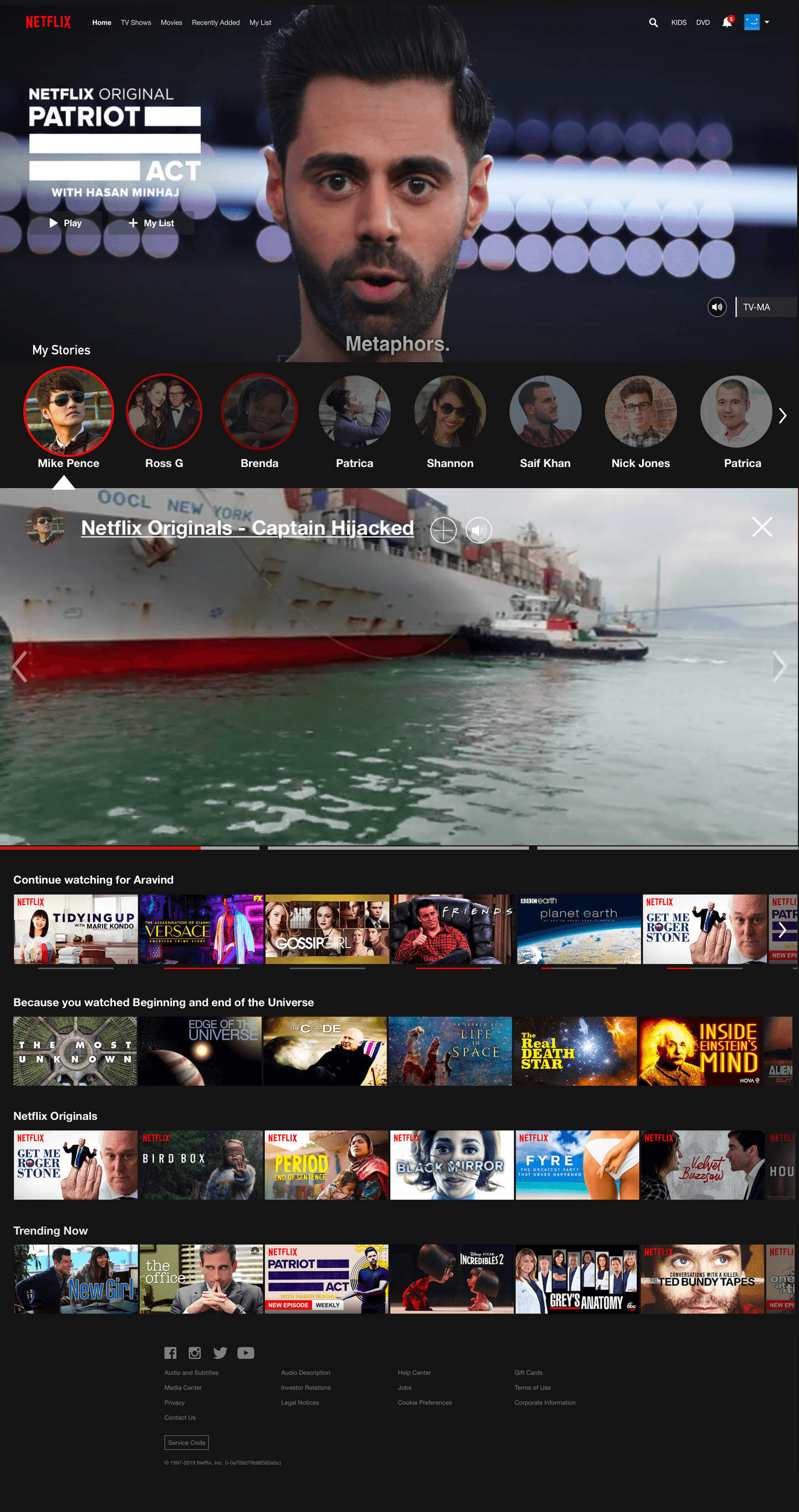
Option #1
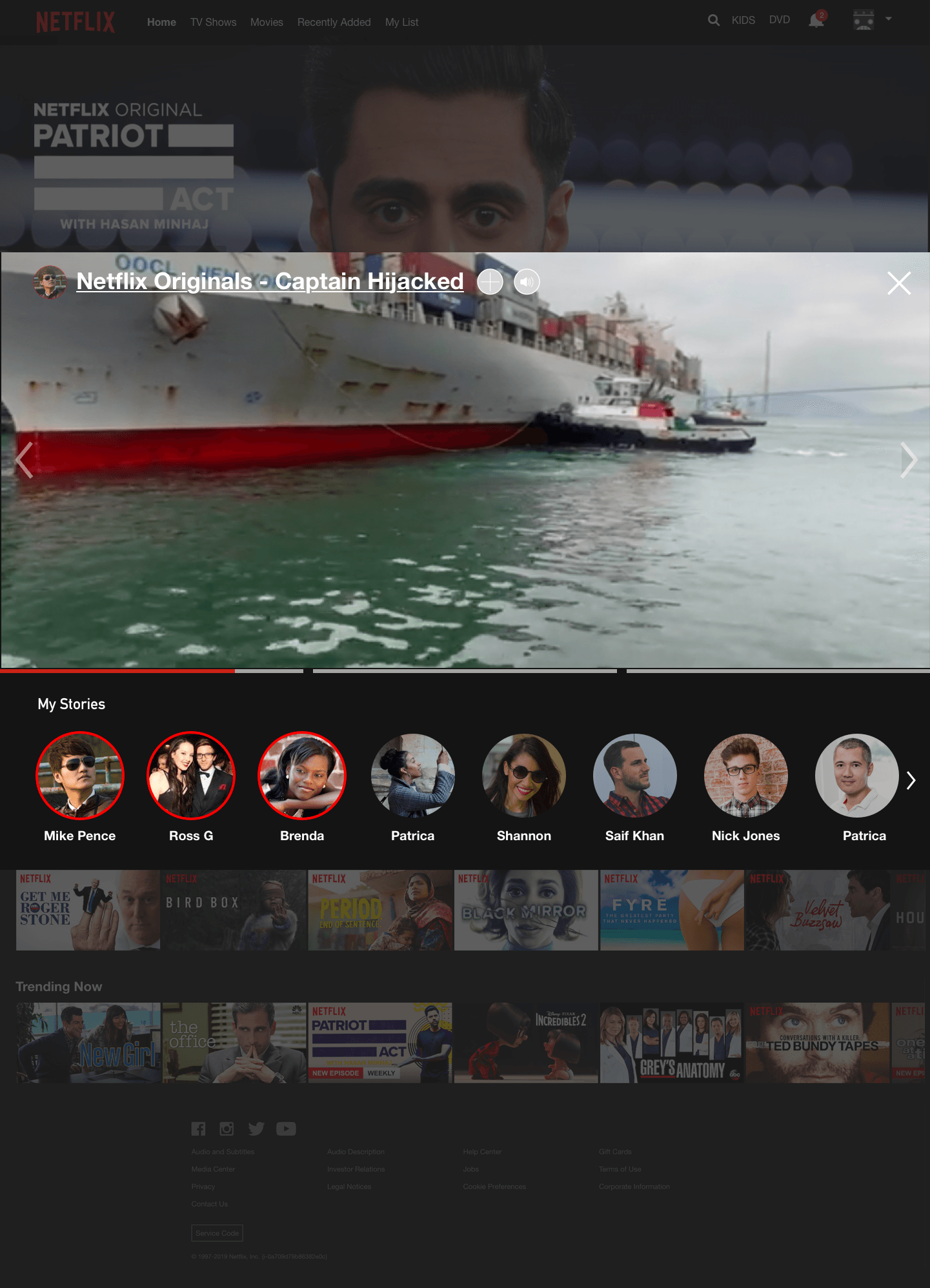
Option #2
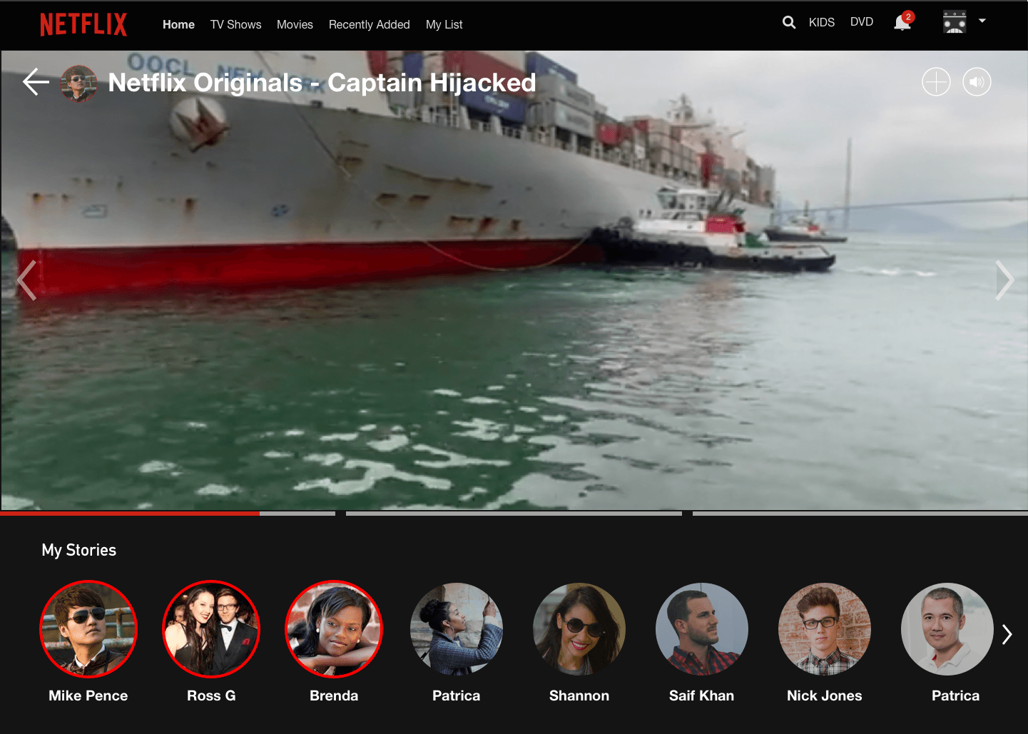
Option #3
Upon reviewing the layouts with others, Option #1 was unanimously voted on.

Group Watch
For Desktop,
For group watch, I had to consider different content style. For example, Movies and TV shows are split separately. In TV Shows, we should consider the entire show from beginning and the specific episode.

Group Watch Icon
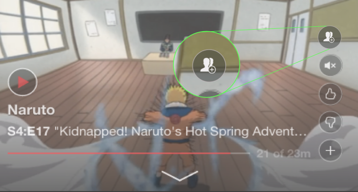
Group Watch for specific Episode

Group Watch for Ongoing Series

Group Watch for New Series

Group Watch for Episodes
While we spoke about the primary user, what about the peer who’ll get invited for Group Watch? I have introduced a notification modal at the side for a prominent CTA.
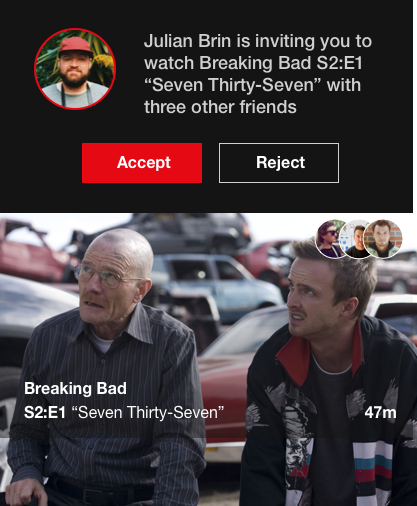
Sticky Notification Page
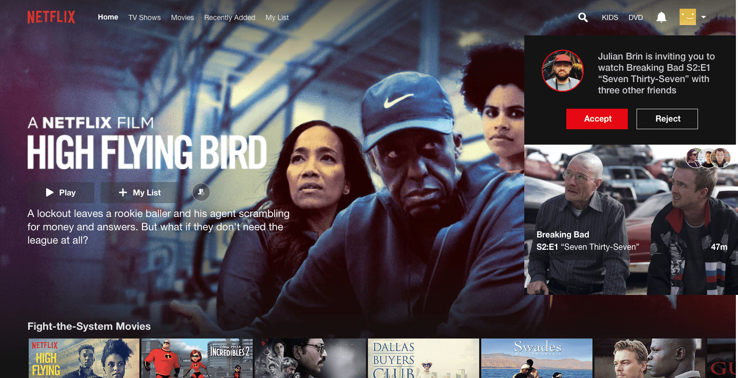
Placement of Sticky Notification
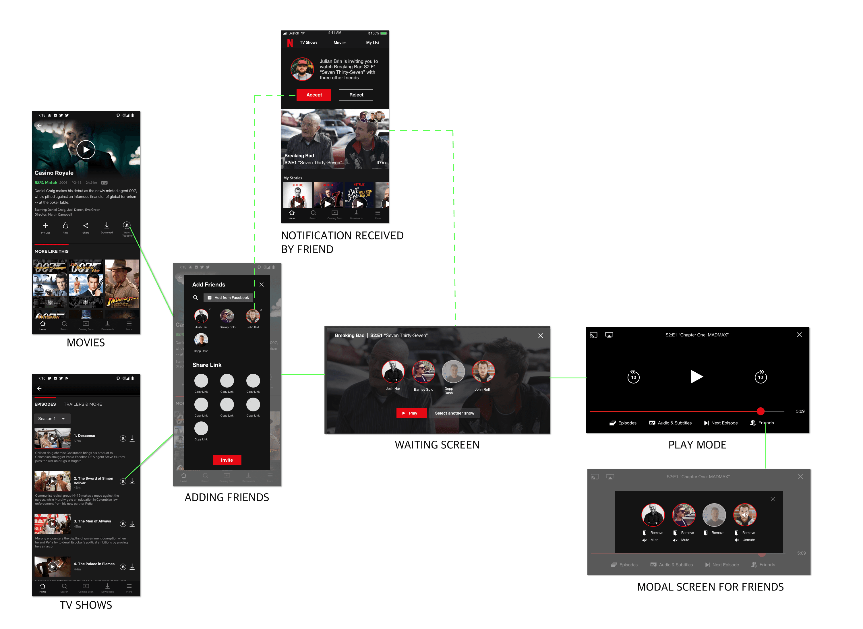
For users to be added for Group watch, I have given the availability of adding friends from Netflix alongwith the option of adding from Facebook. This option will counteract if Friends can’t be found in Netflix directory.
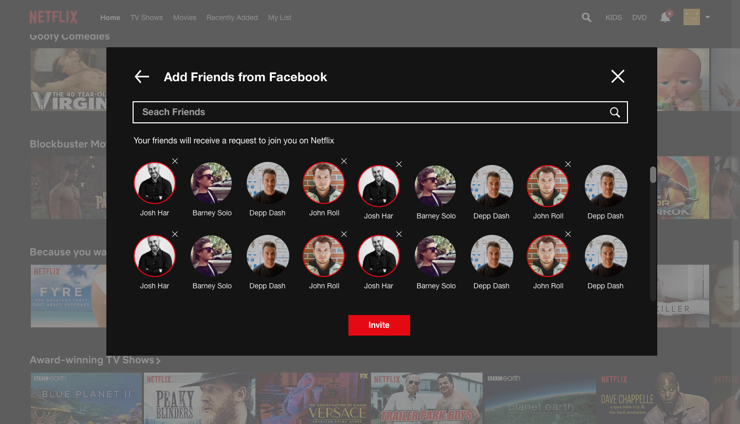
Adding friends for Group Watch (Max 4)
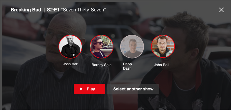
Waiting screen for users to join in
The waiting screen is enabling the user to check whether their peers have come online to start Group Watch. The grey overlay indicates Offline, a slight visual change.

For Mobile,
A similar system is followed as per the Desktop platform, which optimizes the screen spaces and allows for easy interactions.
Thoughts,
While this feature will focus on improving social interaction amongst peers, it’s also a major engineering task. So, I’m not really sure on the feasibility of this feature.
IN-SYSTEM SHARING
While I appreciate the use of 3rd party applications, the localization of sharing content within the Netflix ecosystem will make it easier for users to view content.
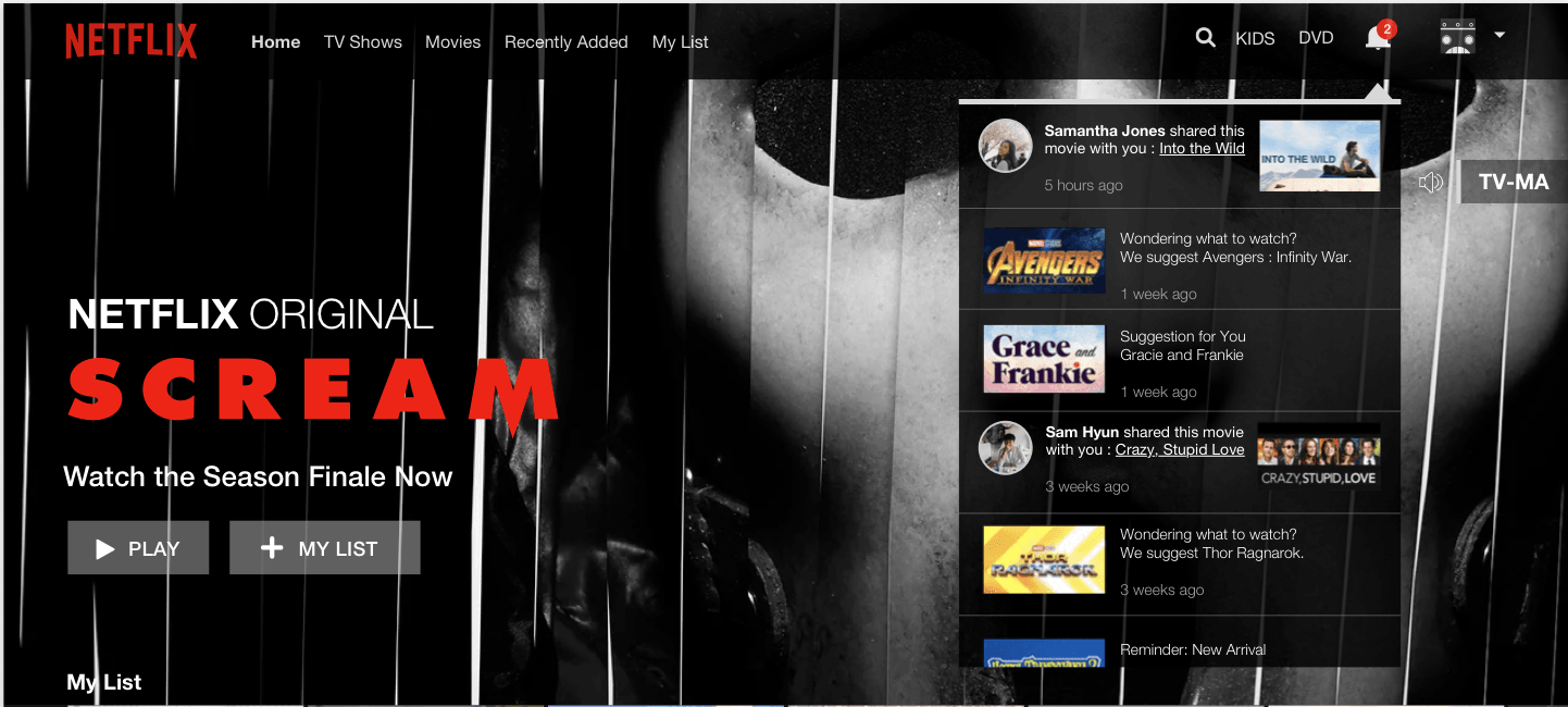
The Netflix notification tab does a similar job of content suggestion, I decided to implement this suggestive tool within the feature.
To share the movie or TV show, I’ve incorporated a simple share button within the Desktop interface ( as previously said, the mobile interface does have a share option)


But what about the other one? The friend who’ll receive the suggestion.
For the other user, a simple notification will be implemented within the notification tab. I came up with 2 designs which follow the Netflix design language
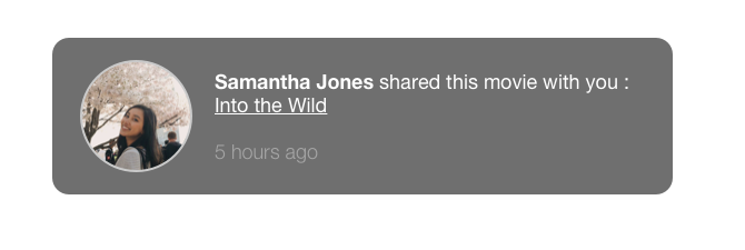
Notification tab with User Profile Image
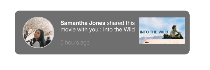
Notification tab with Profile Image and Movie Poster
After reviewing the tabs, the notification tab with the Movie Poster was preferred as it aligns with how Netflix places emphasis on its content
Learnings
1. Congruency takes practice and team-effort, I found it very important to be in line with my team-mates thought process and ideas. It helped us achieve a constant work flow.
2. Considering engineering overhead is vital, wouldn’t want to overburden my developers.
3. Designing for states and use cases are vital for a seamless user experience
