Peloton Interactive for Fitness Instructors
Make exercise more personal with trainer profiles
TL;DR
Peloton Interactive is an application which promotes fitness through its engaging workout videos equipped with virtual fitness instructors. For this project, I analyzed how the application performs within the 5 areas of UX (Usability, Utility, Functional Integrity, Visual Design and Persuasiveness) and whether it follows the Thoughtful Product Design principles by Patrick Thornton.
I introduced a new feature of Instructor Profiles to evoke trust and comfort amongst the user when they use the application for their daily workouts.
Tools: Sketch, Invision
Timeline: 2 weeks
Type: Personal Project
Final Verdict: Introduced personalized Instructor Profiles for the Peloton Instructors, each profile has information about the Instructor, Classes and personal tags.
SOLUTION
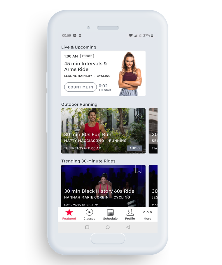
Instructor Cards
Instructor cards will be available on the main screen to ensure that there is more visibility into the upcoming workout routine. Images of the instructors are provided to promote trust amongst the users.
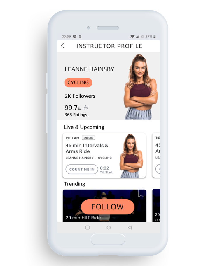
Instructor Profiles
Instructor profiles will provide a personal touch into the virtual trainers, beyond that are sections on Live, Upcoming and Trending. This will help in providing an activity metric into the trainer’s profile, showing that the trainer is active on a constant basis.
PROCESS
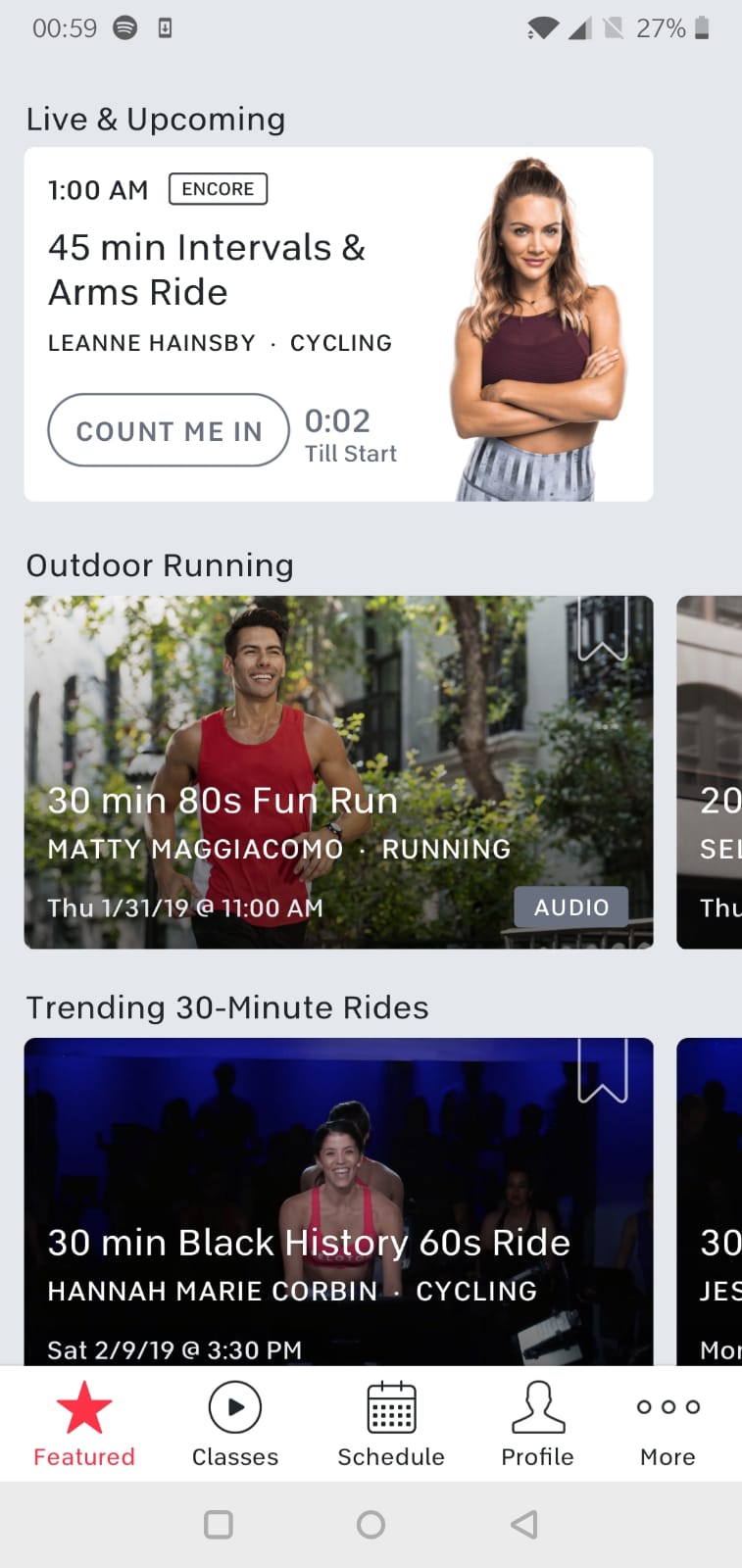
While analyzing Peloton Interactive for its compatibility within the 5 Areas of UX, I constantly used to click on instructor names within the card (above picture) believing it would lead me to extensive profile about them. Kind of a poor discoverability feature! This frustration led me to think and understand the reason behind mentioning the name of an instructor but not personalizing them. Curious about this conundrum I decided on employing a design enabled process to further delve into this.
Research
Due to the time constraints, I only interviewed 3 users. All of my users were involved in Fitness in some way or the other i.e., Outdoor activities, Going to the gym, Conscious effort to be healthy etc.
All of my users were asked to interact with the application while thinking aloud. Meanwhile I observed their interactions while engaging with the applications. My observations and inputs revealed that all 3 users have clicked on the Instructor names on more than one occasion.
Curious about this, I further probed into their reason for clicking on the Instructor name. The following quotes stood out:
“I often stick with Instructors whose methods have been proven. “
“I don’t blindly trust online instructor, I need to know whether their regime suits my system.“
“I often refer to separate instructors specifically for their personal videoes“
Ideation and First Version
After conducting and interpreting my interview notes, I decided on introducing Instructor Profile to help promote trust and comfort between the users and the application. My focus was on maintaining the same layout and color scheme followed. I decided to introduce the following features within the Instructor Profiles.
1. Ratings– One of the key insights from my interview revealed users are drawn towards Instructors with good ratings from past users.
2.Followers– Indicates the wide reach of the instructor, allows the users to qualitative understand the popularity of the instructor’s workouts.
3.FOLLOW Modal– This option is to signify follow as the main point of interaction.
4.Tags– The tags option is a sticker interaction which signifies good review in a pictorial format.
5.Workout Information– Similar to how Peloton usually showcases information with a horizontal scrolling option, I decided to implement the same such that user can see specific content curated by each Instructor
Other than the Workout Information tab and Follow Modal, the remaining features will give emphasis on the Instructor’s mettle on running workout options. I decided to implement a calling card like design to incorporate all the features.
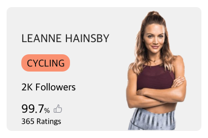
Upon reviewing the calling card design, I found out that it gave the users insights into the popularity of the instructor and further triggered them to be more curious on why such ratings were given.
The inclusion of the FOLLOW and FOLLOWED modals further enabled the users to choose whether the instructors is right for them.Hick’s Law states that as the number of options increases, so does the decision time. This modal acts as an USP once the decision is made.
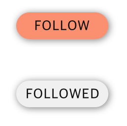
The inclusion of the FOLLOW and FOLLOWED modals further enabled the users to choose whether the instructors is right for them.Hick’s Law states that as the number of options increases, so does the decision time. This modal acts as an USP once the decision is made.
The Instructor Profiles page started to take shape. I followed a hierarchical format for the workout exercises.
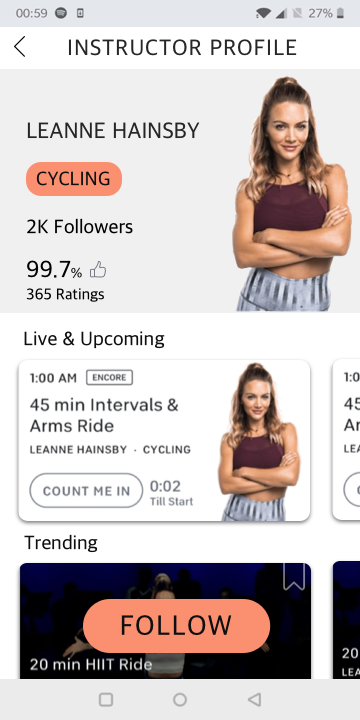
Few problems were raised after users tested this design:
1. Horizontal scrolling within the Live & Upcoming and Trending tab would take the users a lot of time to take conscious decisions. Hence increasing waiting time.
2. The repeated usage of same imagery of the fitness instructor will fail to capture the user’s attention after constantly scrolling.
It was clear that my initial design implementations were flawed and led to user frustrations.
Re-visiting and Re-iterating
The initial user tests gave me an opportunity to introduce what I call “View Sliders”. A simple switch which will toggle between Horizontal scroll (Cards) and Vertical scroll (Schedule).
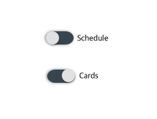
Cards – This design feature is similar to Peloton’s current visual representative, User will see optimized information about the workout.
Schedule – This design features mimics a timetable system, where exercises upcoming/released will be arranged in a linear format.
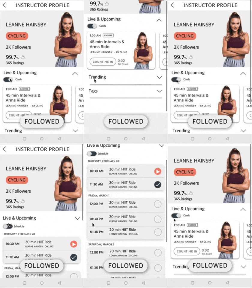
Upon shifting to vertical scroll, the user will have to constantly scroll down which again increases decision time. So to counter this problem, a simple dropdown feature will become available for the users.
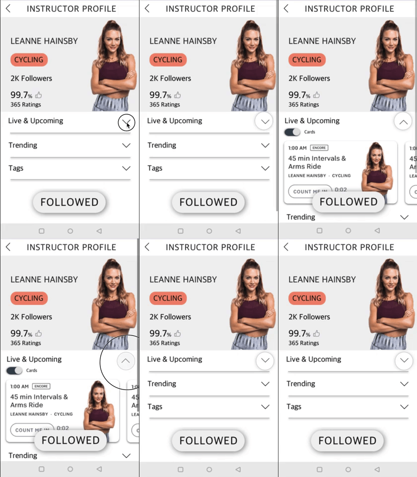
Designing for Implications
Design states are localized areas within the digital system that leads the users away from the ideal flow. I never know that we called them that! This further helped me widen my approach.
Empty State
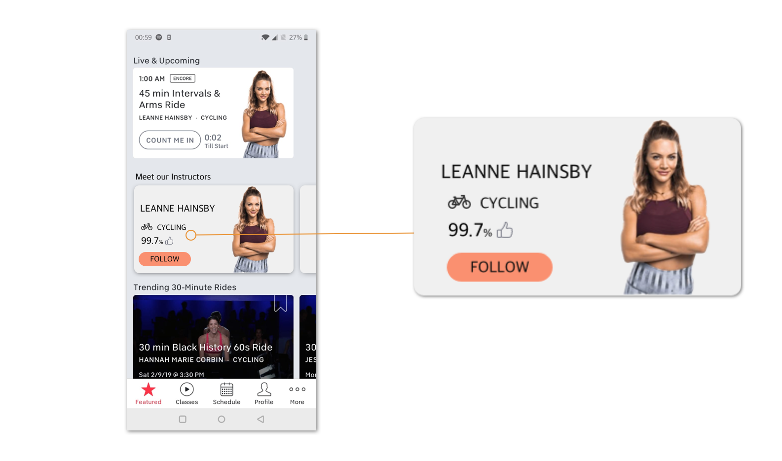
When the user first joins the application, how do they follow instructors they are interested in? I introduced an extended calling card with Instructor Information.

INSTRUCTOR CARD
Some State
As the users become acquainted with the functioning of the application, they’ll need a new system for the Instructors. I reduced the size of the calling card with name and specialty being the only parameter retained while notification on new workouts will be signified by a small numbered check on the top right
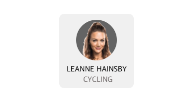
NO NOTIFCATION
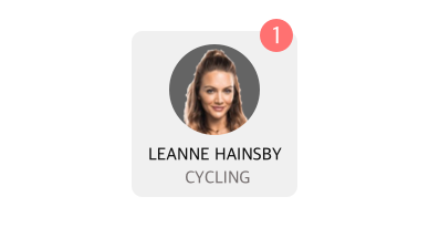
WITH NOTIFICATION
EXAMPLE SCREEN
LEARNINGS
1. Consider the interaction for each of your designs, it’s vital to consider the role constraints play with our interactions.
2. Design states should be kept in mind while designing, wouldn’t want our users to get distracted by such nuances.
3. Re-visiting features time-to-time promotes an engaging act of self improvement
