Enhancing Content Discovery for Library of Congress
How might we improve customer engagement by introducing new experiences for content discovery and interaction.
TL;DR
Role
Product Designer
Client
Library of Congress
Timeline
Aug ’19 – May’20
Team
Aashrey Sharma, Christine Pisarczyk, Mahitha Kalyani & Ghazaleh Keshavarz
Business Goal
The Library of Congress wants to explore new ways for media discovery and interaction for their Audio/Video Collections to improve the engagement users have with each artifact and collection.
Solution
We introduced product features and minimal features to effectively create a system which leverages the current meta-data model and segments the vast data in a simple and digestible format. This solution effectively streamlines positive content discovery by 65%!
Curious about how I realized my final design solutions? Then click here
“The Library of Congress gets an average of 7 million users per month visiting their online digital media collections.“
Design Solutions
Topic Detail
Problem
The LoC has a lot of multi-type content AND constantly introduce new content. Due to this, users have difficulty in identifying content relevant to them. Since the LoC’s major user groups are Educators and Researchers, having a simplified way to find relevant information is important
Solution
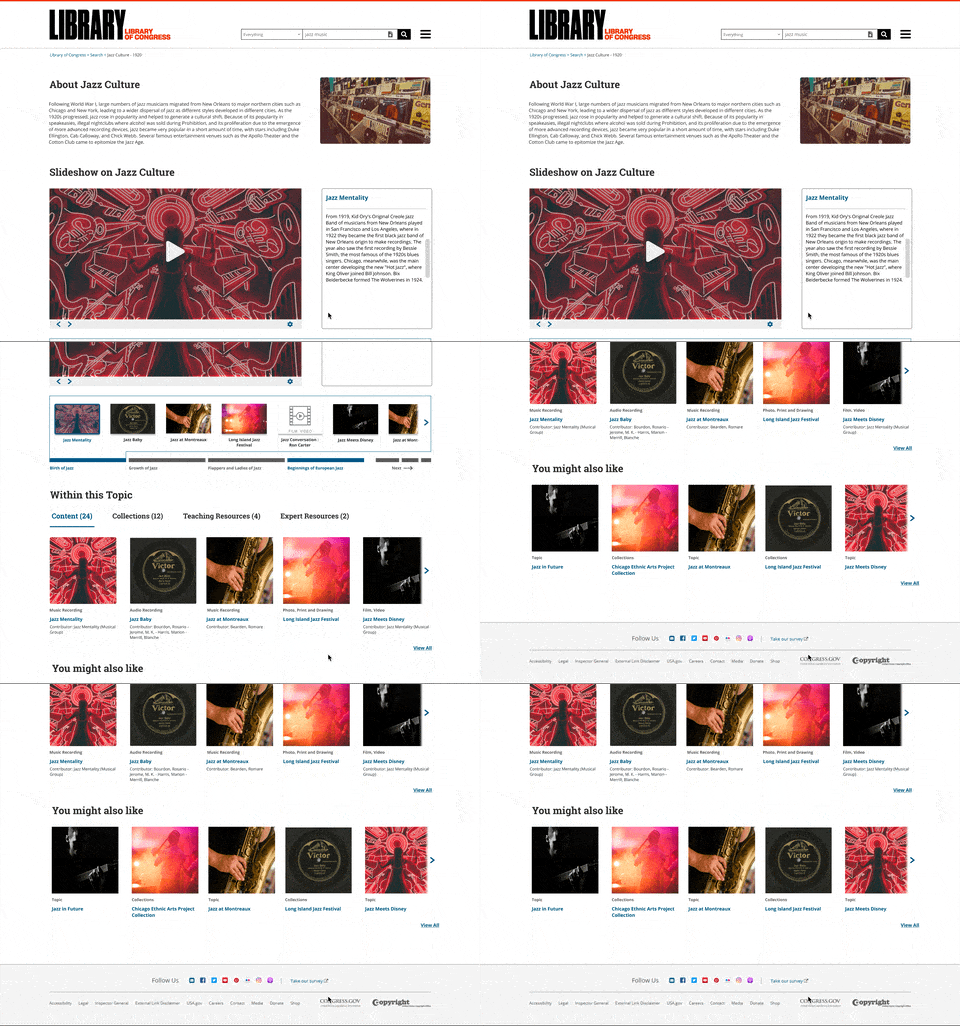
Topic Detail pages segments content with similar timelines, contexts or events into a singular page. Again, going through all these content is cumbersome. Hence an interactive slideshow with a timeline is included to provide that story-telling format, making content discovery more contextual. For a more in-depth understanding of the Topic Detail, Click here
Search Results
Problem
While going through a list of content, users look for hints or elements which suggest relevancy or importance. Introducing tidbits of data which can aid in simplifying user’s decision making time is important.
Solution
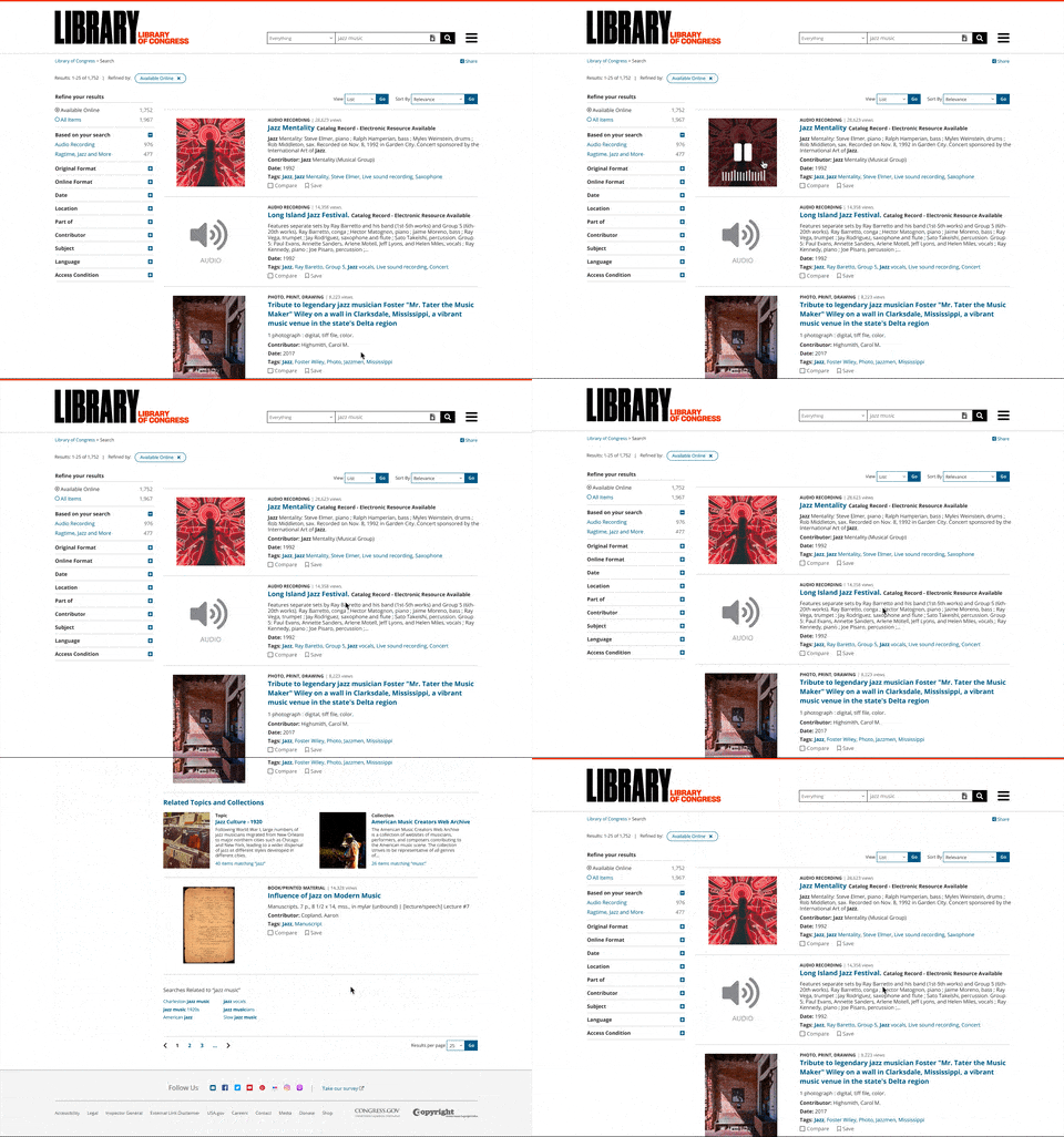
Providing usage metrics, alongwith a preview option allows users to contextually understand whether a specific content item is relevant to them. Related search results are also introduced to allow for serendipitous searching. For an in-depth view of Search Results, Click here
Media Search
Problem
Users have an initial idea in mind when they are searching for media. In order to compensate for the lack of visual searching, users type in numerous keywords in the search bar with the hope that the algorithm understands the keywords and generates the result closest to that initial idea.
Solution
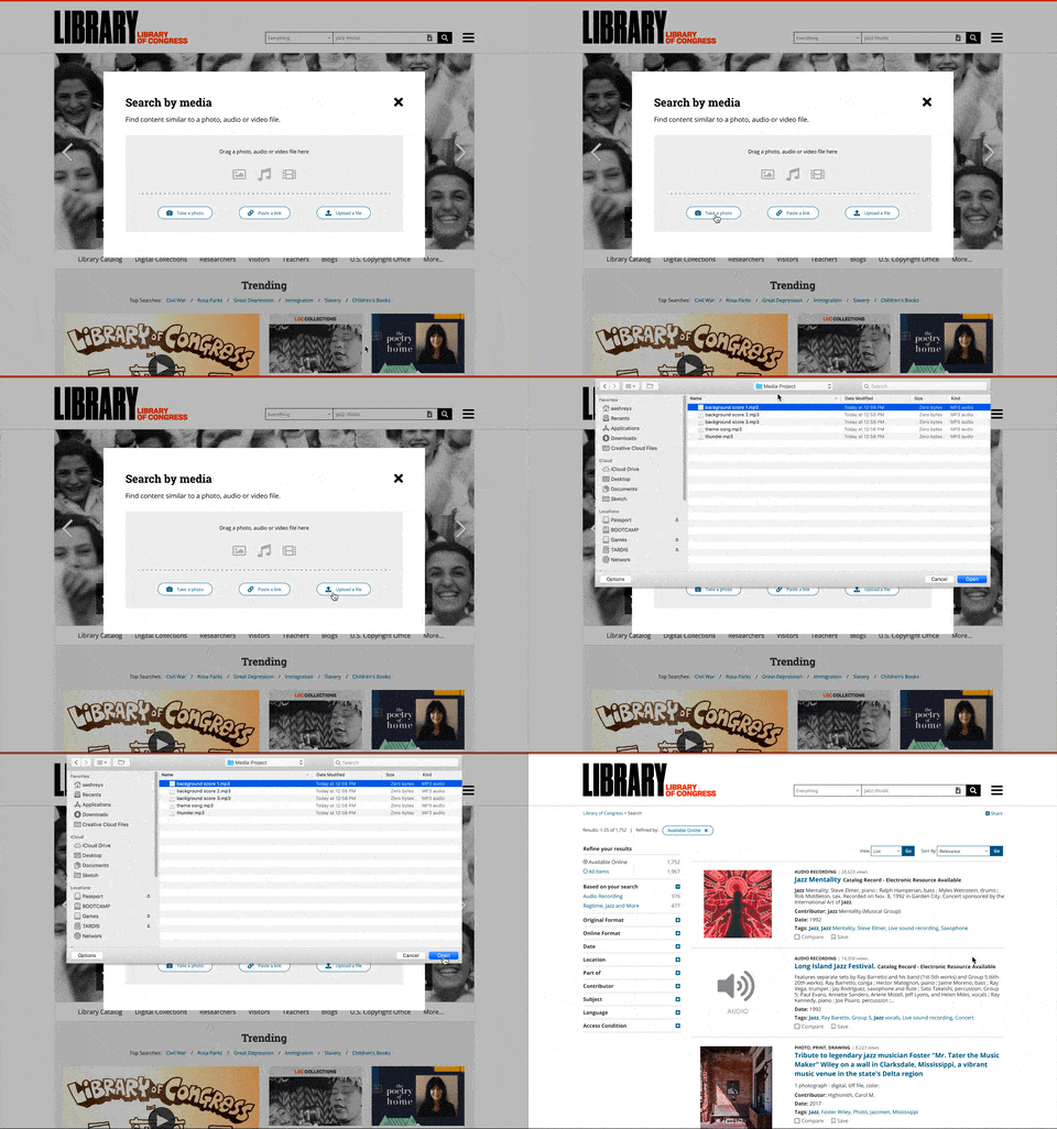
Search by Media allows users to Take a Photo, Paste a Link and Add File. After inputting the media type. LoC will automatically curate a list of similar content pieces based from the Media file, hence reducing the constant iteration of search keywords. For an in-depth view of Media Search, Click here
Content Detail
Problem
Historically, users used to listen to the entire audio file or skim through the audio file with the hope that they find an artifact of importance. Naturally such a process takes a lot of time
Solution
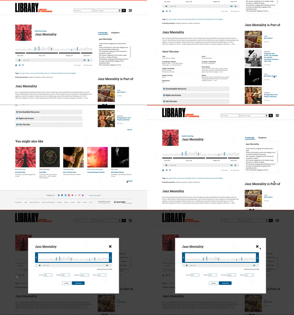
Introduced an audio waveform with segmented chapters for easier access. Also dynamics transcripts allow for quick and easy search for relevant information within the audio file. Addition of these features will augment the current experience of using the content detail pages. For an in-depth view of Content Detail, Click here
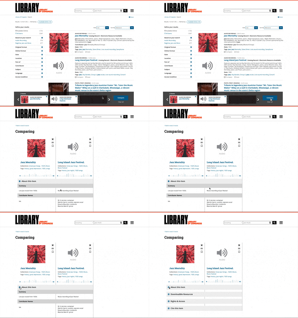
Content Compare
Problem
Creatives looks for selective elements within content pieces. It was evident from research that users open up numerous tabs and contextual decide on content pieces.
Solution
Provide a simple compare option where users can contextual compare different content types seamlessly. While presenting this to our stakeholders, the idea of an audio editor also was discussed. Where creatives can mix and match different audio files.
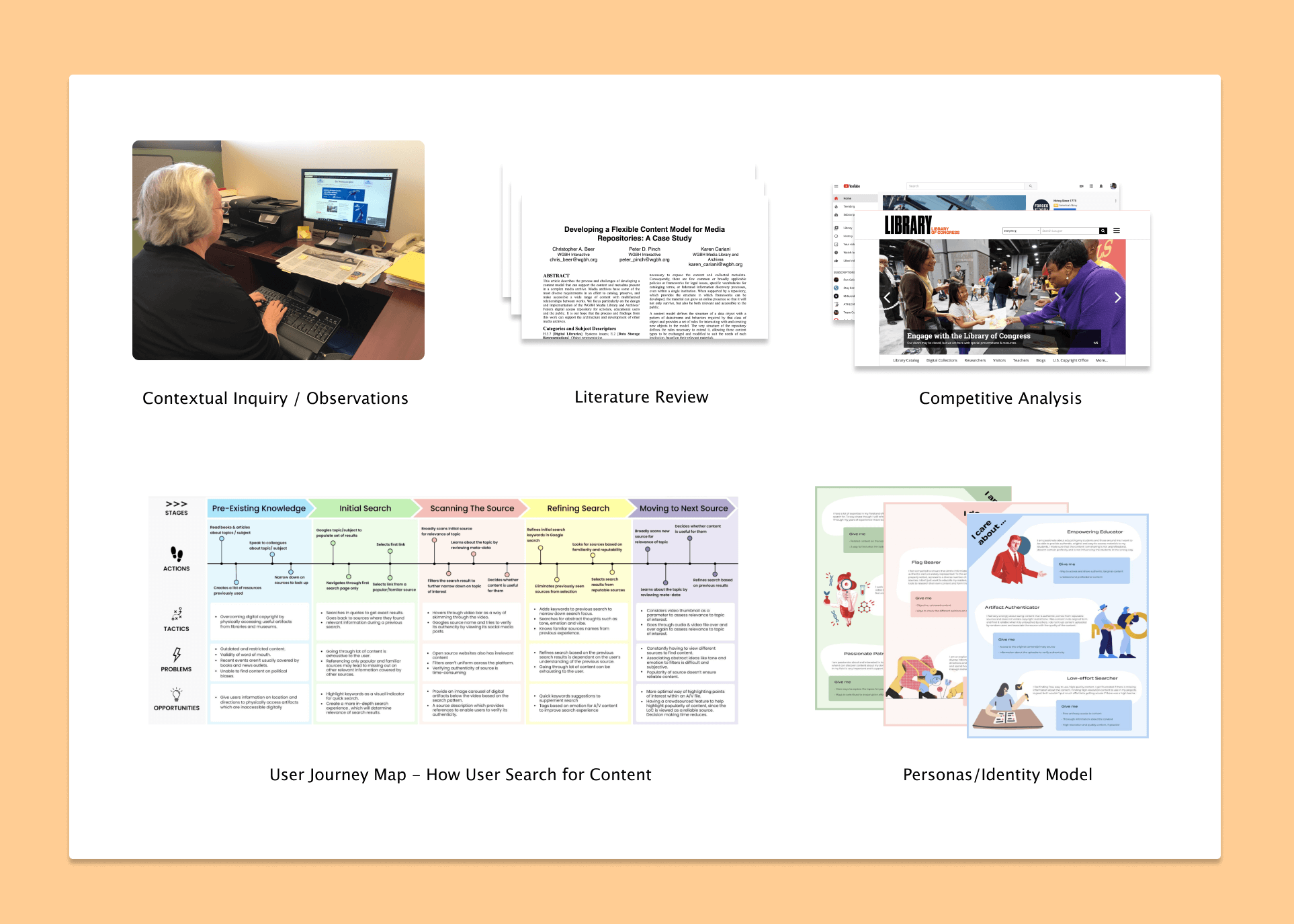
How I understood the problem space and emphasized with my user groups
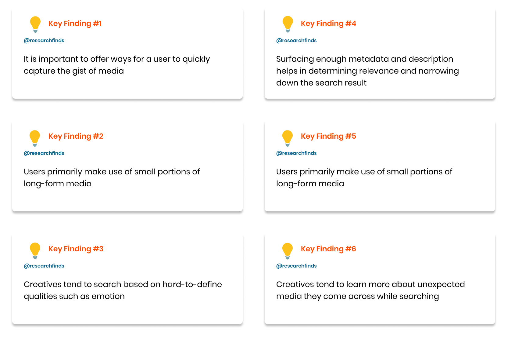
The research findings provided a strong foundation to work on.
Finalizing on metrics for success
After presenting the research findings to our stakeholders, we finalized on few metrics which will determine success for this initiative. There metrics are:
- Positive user sentiment upon finding relevant content.
- Reduce drop-off rates from search results page.
- Higher engagement with media content.
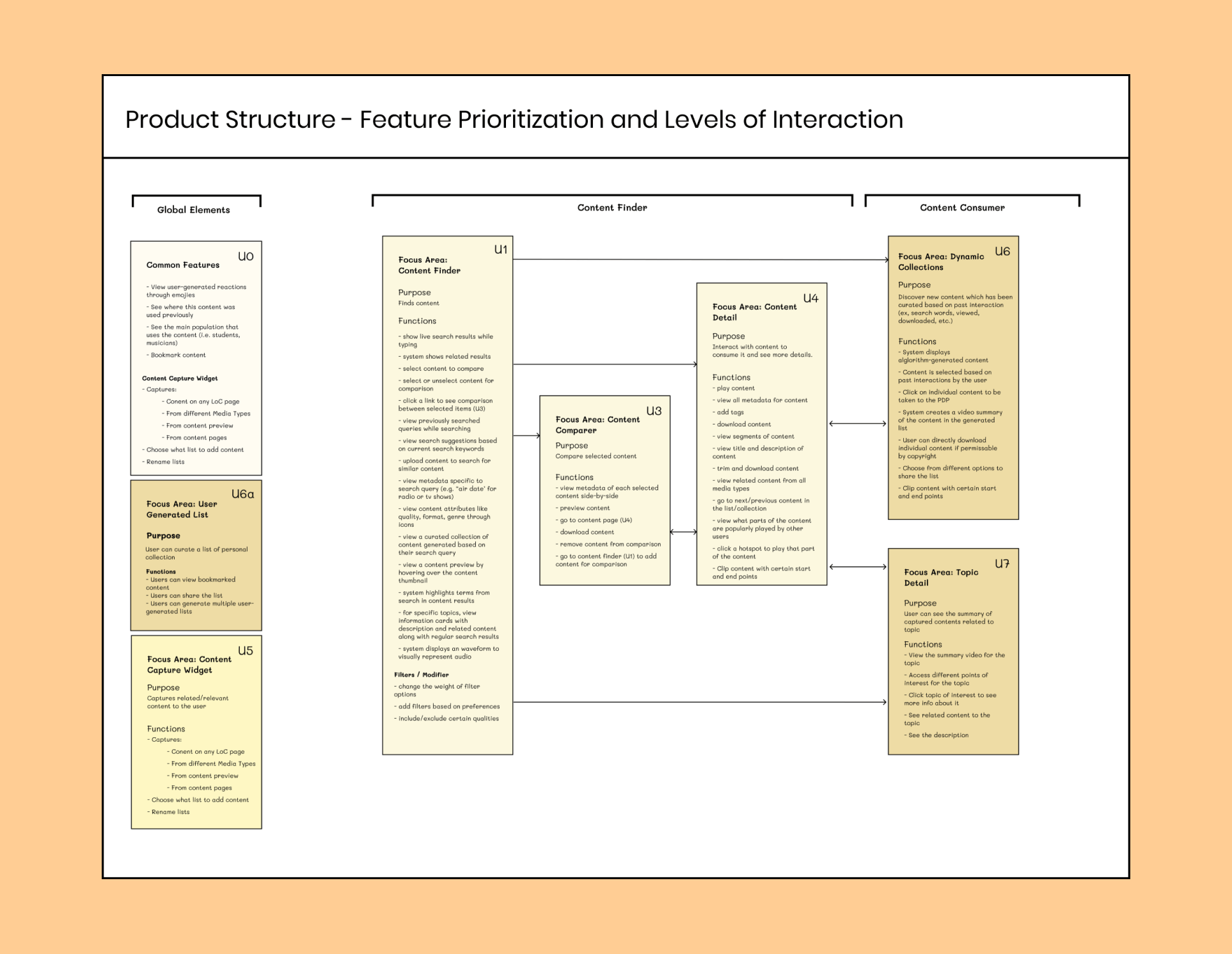
Defining the product structure and interaction patterns powered by our research findings.
We understood from our research that there is no one way of determining relevancy of content pieces. Users would often use certain hacks i.e., opening ‘n’ number of tabs, bookmarking pages etc as a way to determine relevancy. All this highlighted how the current experience limits the scope of the user’s search needs.
So we asked ourselves, instead of creating a new experience for content discovery. Why not elevate the current experience and consolidate our brainstormed product concepts into the platform. This will accelerate the time duration and ensure that a beta will be online sooner than anticipated.
The Library of Congress has an established brand guide, but not a style guide. So we took the current design patterns followed on the website combined with the brand guide aesthetics and created a simple style guide for consistency across each member of the team.
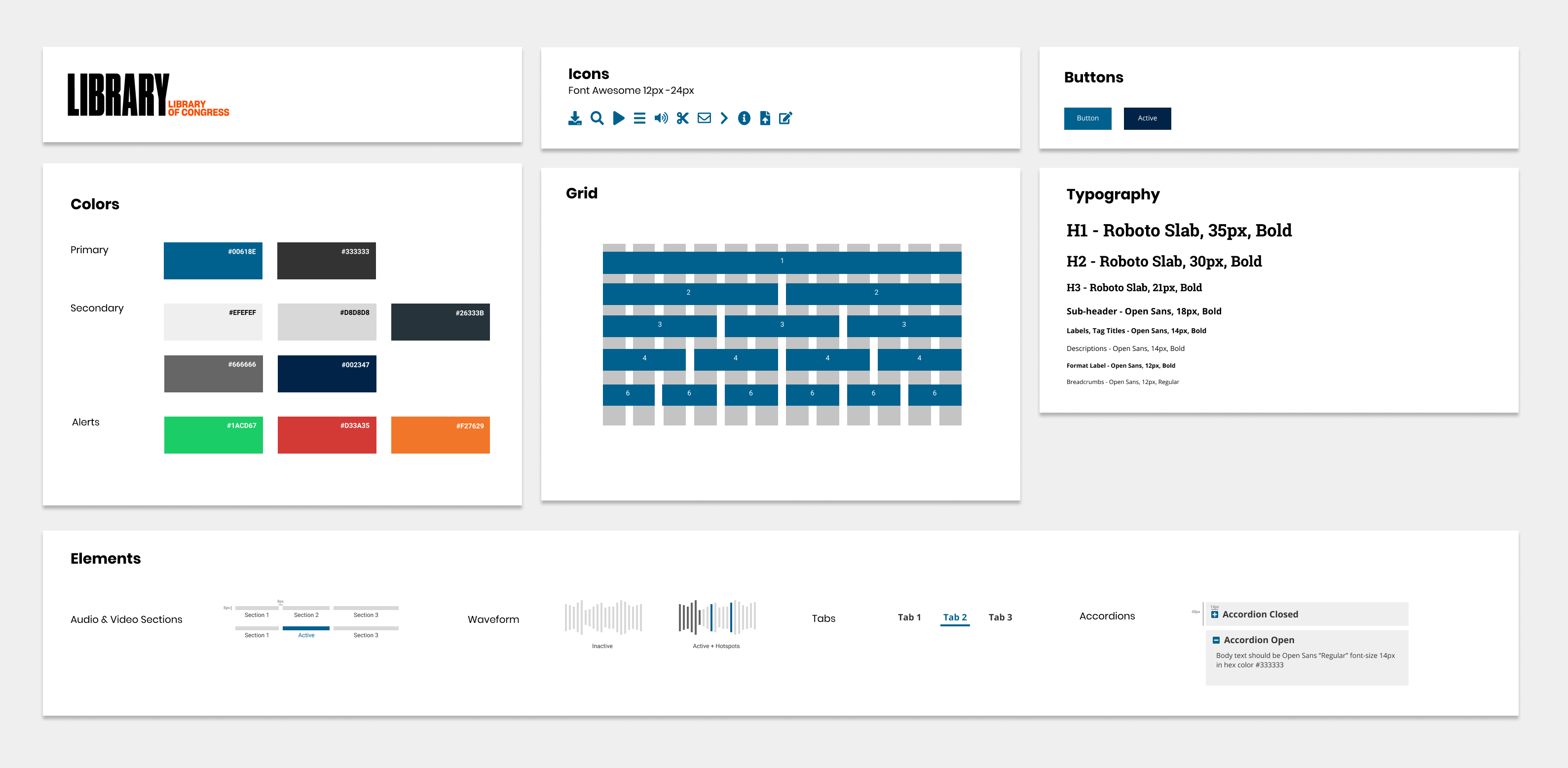
Starting from scratch and re-iterating wireframes from user and stakeholder feedback
I sat down and started creating wireframes based from the product structure diagram which provided a strong base to work off. Each wireframe was first discussed within the team, followed by my stakeholders and then user-tested twice over the course of 2 months.
Our features have a blend of content segmentation, metric inclusion and micro-interactions in order to augment the experience of searching and determining content relevancy.
Topic Detail
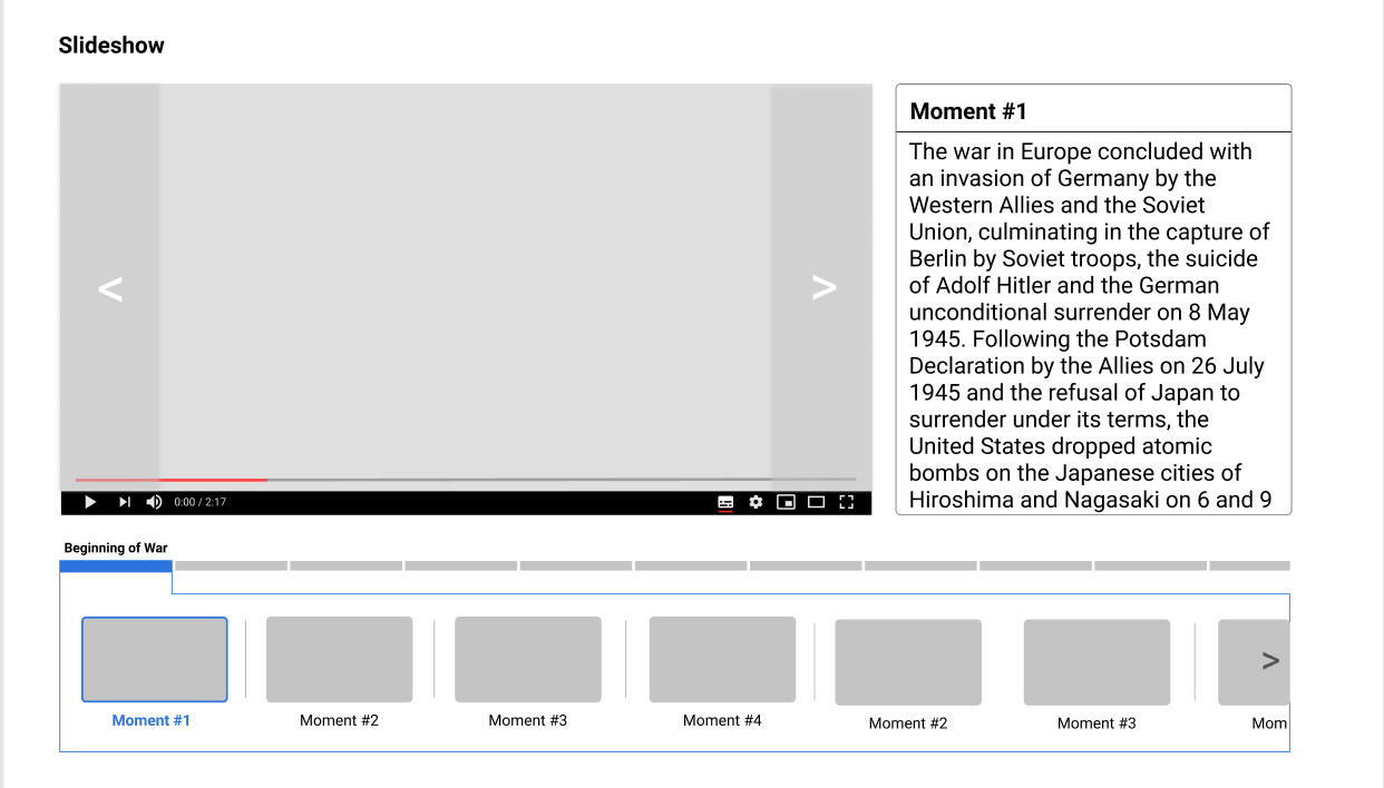
Different media types are segmented into different topics of choices. This page will include a brief description about the topic, an interactive slideshow with a carousal style interaction for the slides. This page will also have a repository for content used for this page alongwith additional resources for Teachers and Experts.
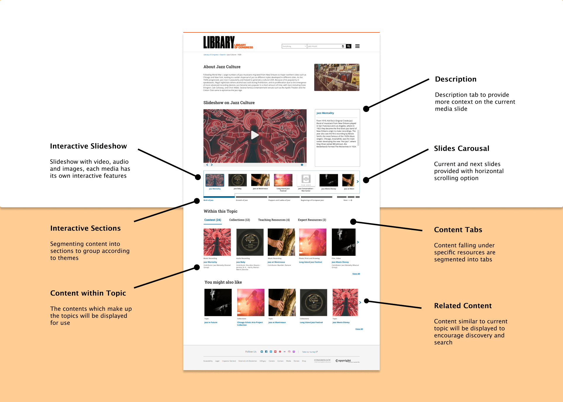
The above interaction and screens were a result of 7 different iterations from 4 feedback sessions (2 Stakeholder and 5 User Tests). Additionally I introduced intuitive micro-interactions to seamless showcase the parent-child relationship within the slideshow


The core functionality of the topic detail page is the slideshow which was trickiest part of this page. We had to show effective segmentation of slideshow content in order to ensure the user doesn’t get overwhelmed with the sheer volume of content. The slideshow played its role in aiding search and determining content relevancy in the slideshow.
The first option was to include a video which summarizes the entire topic content into a digestible video, the second option was a multi-media slideshow with segmented chapters and the third option was also a multi-media slideshow with timelines and segmented chapters.
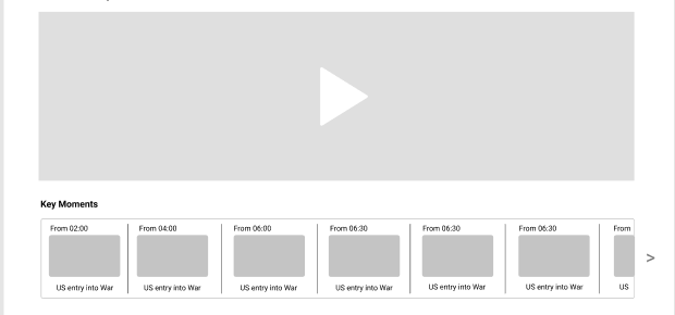
Option 1
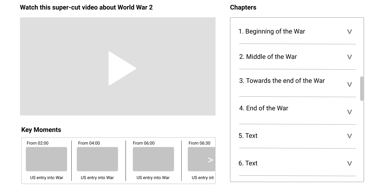
Option 2
Option 3
After testing the options with users and stakeholders, I concluded that the third option was the best, because Slideshows were a more effective way for showing content due to the different nature of media files. Also to summarize a video from different media types to effectively create a story-telling experience was technically challenging.
Media Search
In lieu with keyword search, users can search using media types such as Image, Audio and Video. The system analyses the media type and provides the similar results to the uploaded media field.
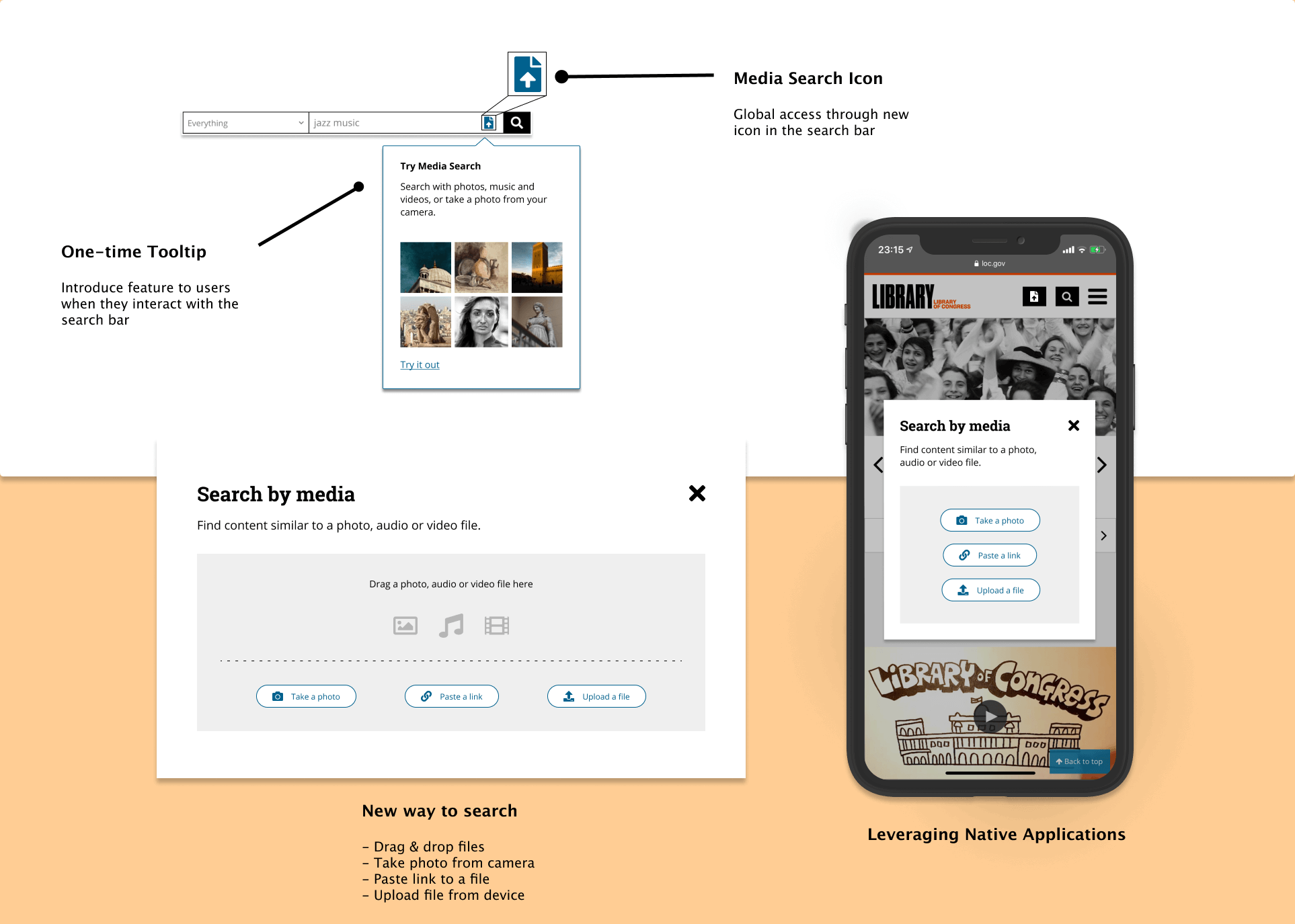
Searching using media types allows users to find for media types which they are contextual aware of or have previously triggered to search for. Users have 3 different options for searching media, these are Take a Photo, Paste a Link and Upload a File. Especially the Take a Photo feature which effectively leverages the mobile native capabilities.
Our initial idea was to introduce a simple drag and drop option alongwith a paste file option. But while testing this feature, we observed that users especially creatives look for inspiration based from a single source. Then when we probed more into this behaviors, we found that all our users exhibit the same behavior while doing serendipitous searching!
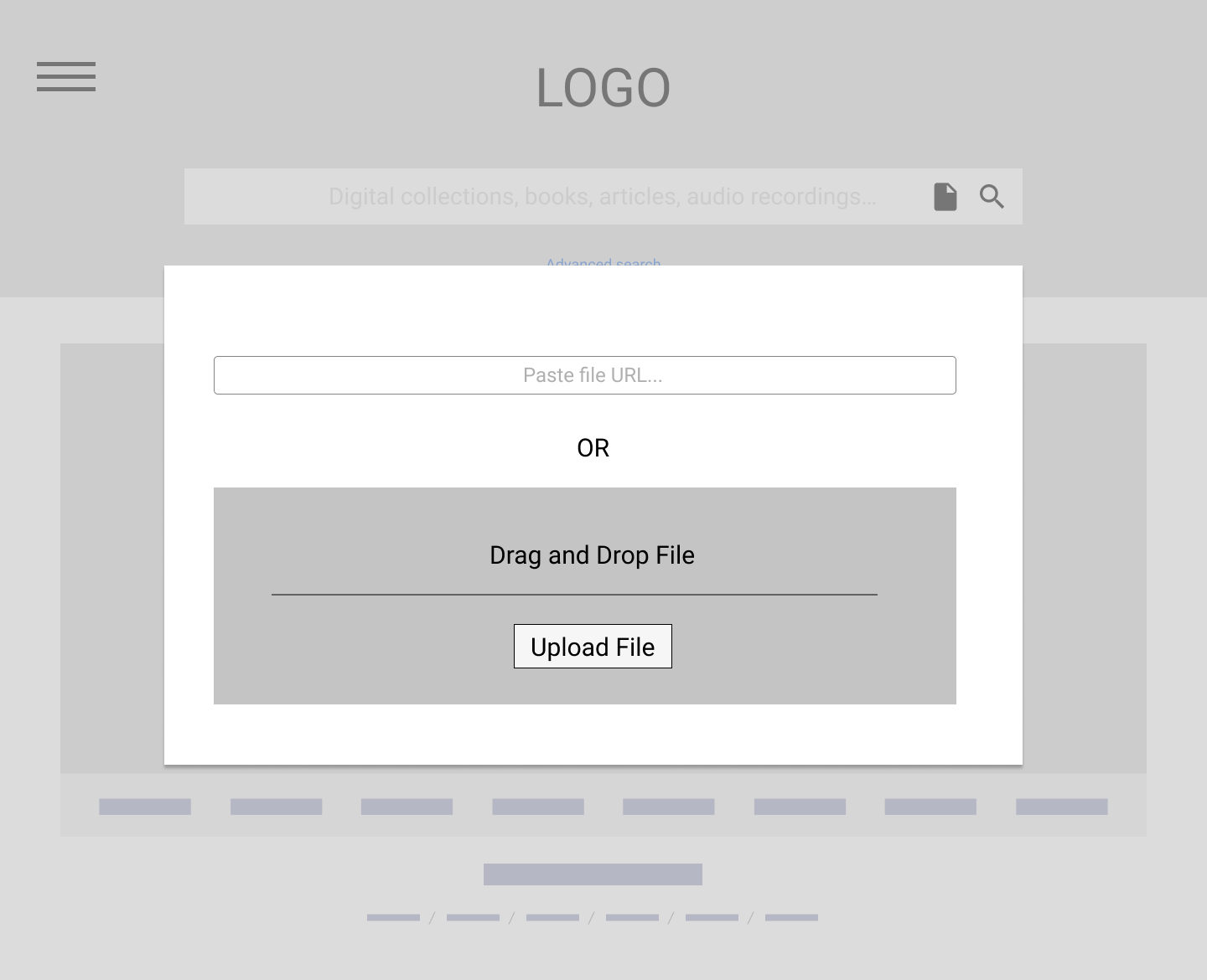
Lo-Fi Wireframe for Media Search
Search Results
We have added new metrics and small features to elevate the current search experience. Some features that we added are View Metrics, Recommended Filters, Compare Content and Compare Tray. The addition of these features has minimize the decision making time of our users.
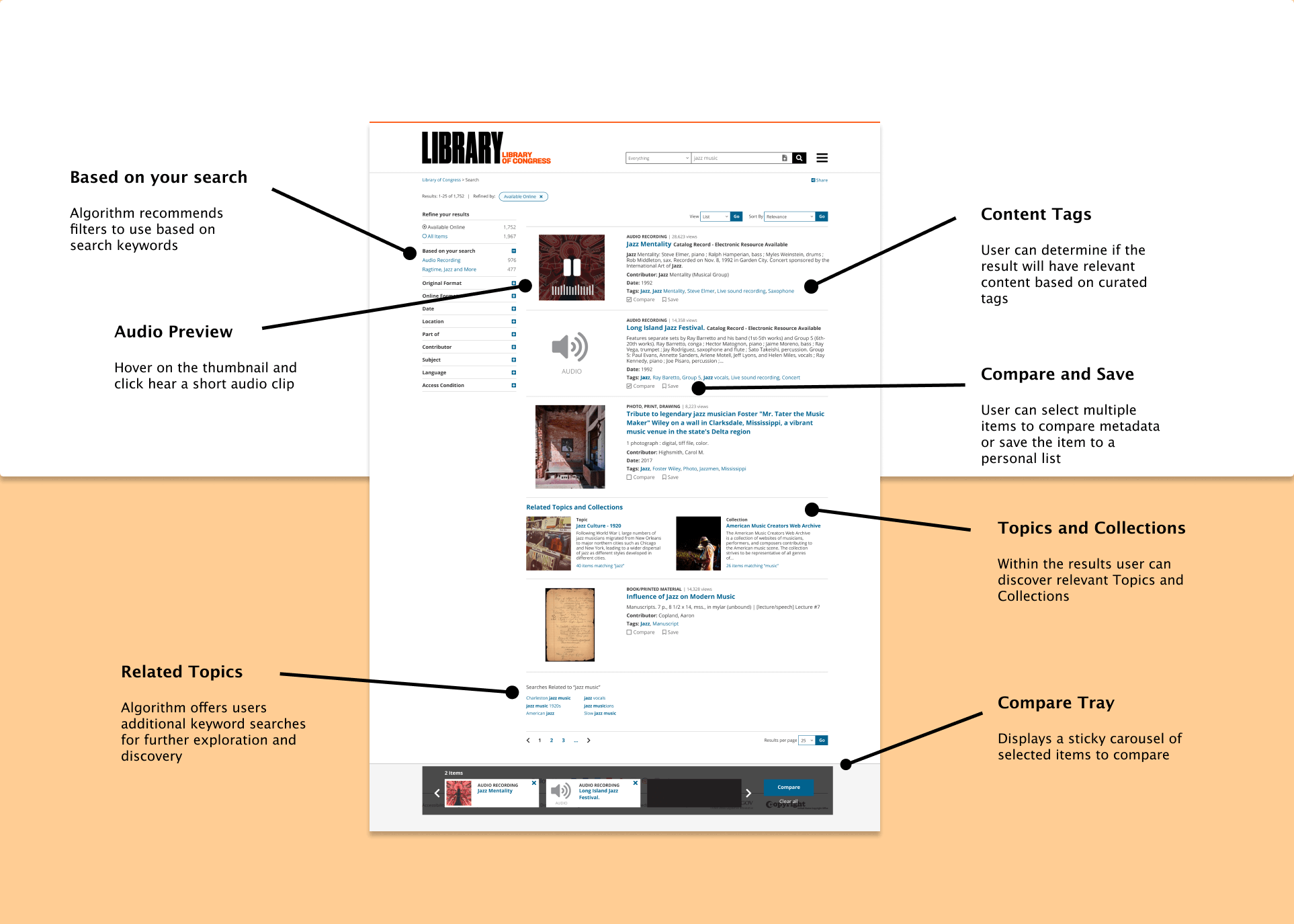
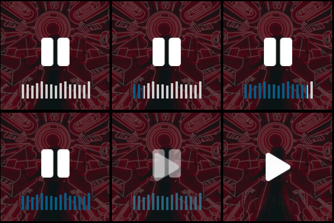
The dynamic thumbnail feature allows users to listen/view a snippet of the content file. The snippet is taken from a popular verse/time of the media file, which can be determined through previous usage metrics. The rationale behind the dynamic thumbnail was to provide more awareness to the user about the content they are viewing such that it will aid in their media discovery process.
Placement of search results had quite the discussion, the rationale of the visual hierarchy of the page was to provide more importance to the search results. Previously, we introduced Topics at the start of the search results page but we realized that it takes away the importance from the search results and places it on the Topics.
We also considered having a collapsable tab under each audio search result which will house the audio waveform , but tests had shown us that the tab was hidden and defeats the purpose of having a detailed audio content page as users quickly played the audio file and moved on.
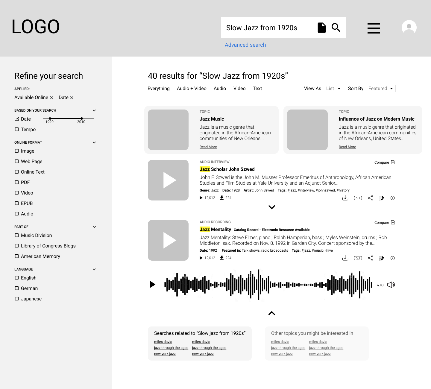
Lo-Fi Wireframe of Search Results page
Content Detail
We redesigned the content detail page by introducing new features and changing the visual hierarchy. We introduced visualized Audio files in the form of waveforms which are segmented into chapters to allow for easier searching.
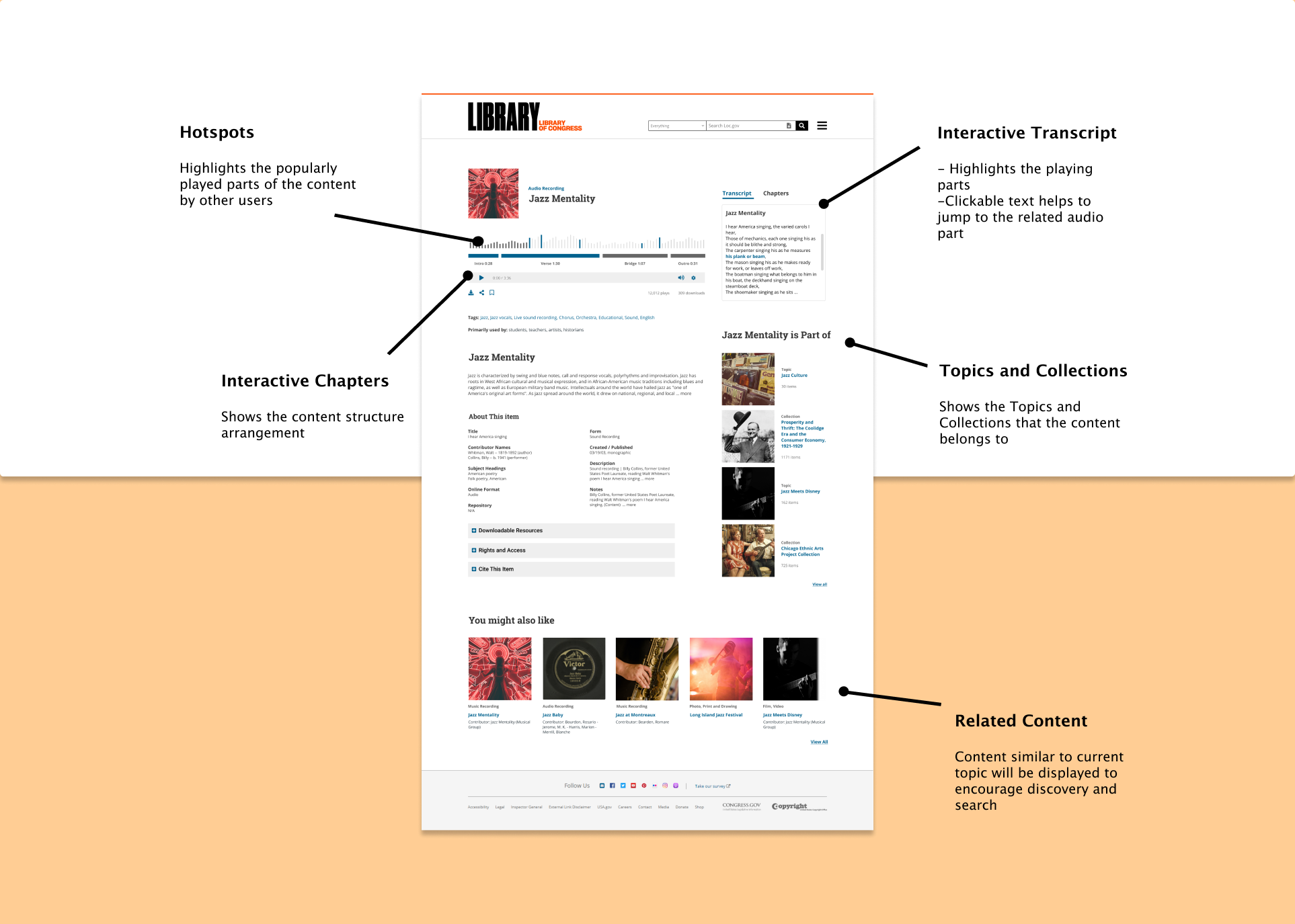
Due to copyright laws, it was important for us to create a layout that will be consistent across the different media types. The waveforms, chapters and transcripts work in tandem and allows users to learn more about the content piece easily. Interactions played a huge role here, effectively allowing a easy flow across the transcripts, chapters and waveform.
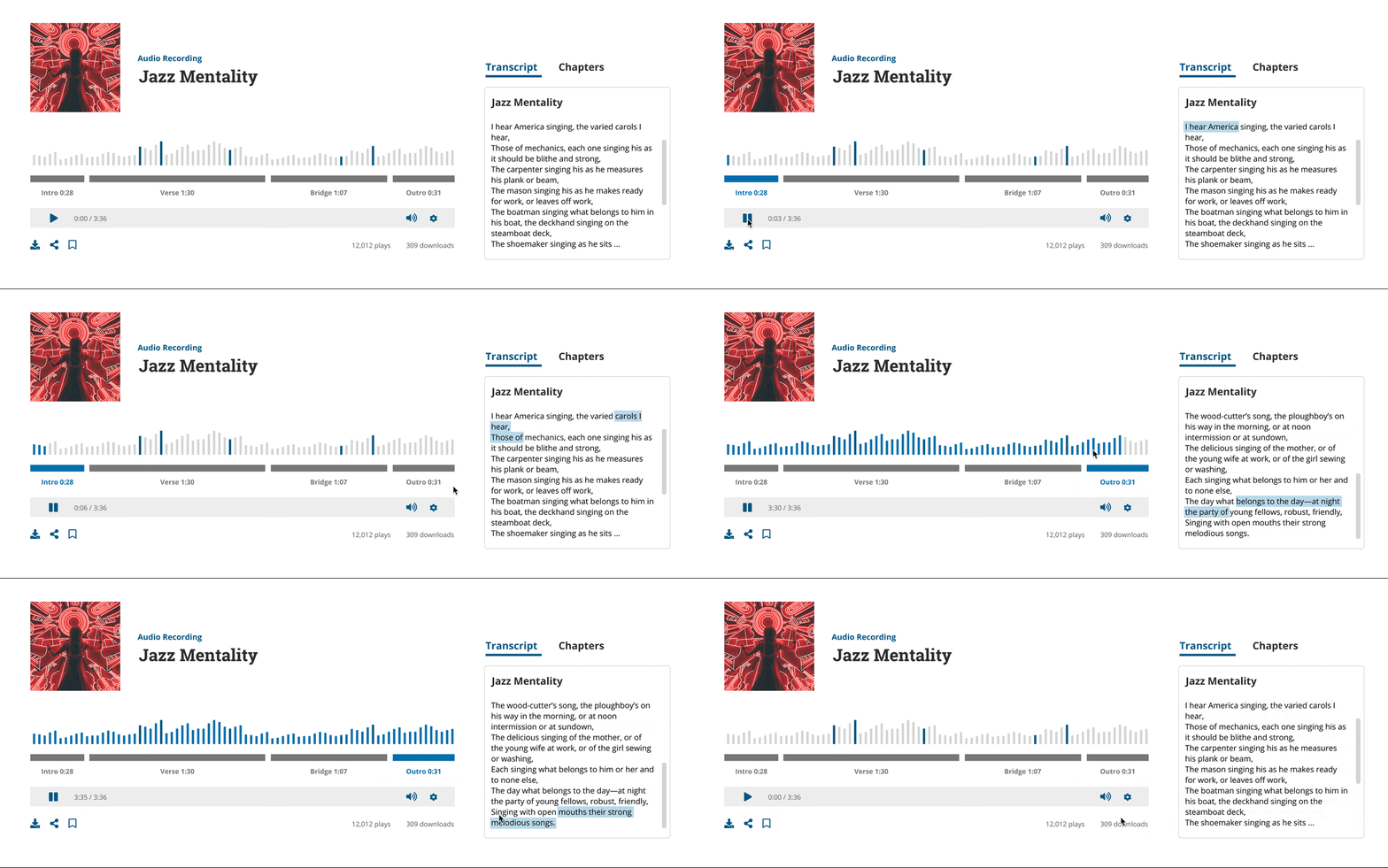
Evaluating the experience
The metrics after testing were positive in successful engagement in dynamic features, successful task completion and reduced time taken to complete task. We also ran a UEQ, where the results were favourable in terms of Attractiveness, Dependability and Efficiency.
