Exploring Augmented Reality
UX Design and Usability Tests for AR App
GHOSTBUSTORE AR
TL;DR
GhostBustore AR is an augmented reality mobile application for Ghostbuster fanatics. It allows users to learn more about the Ghostbusters Universe in a fun interactive manner.
MY ROLE – UX Designer (Mobile + AR)
Mainly contributed on AR, Mobile and video production. Lead design sprints and concept development.
TIMELINE
Oct’18 – Dec’18
TOOLS USED
Sketch, Figma, Invision, Unity & Whimsical
TEAM
Aanesha Satpati
, Modassir Iqbal
, Naishi Jain
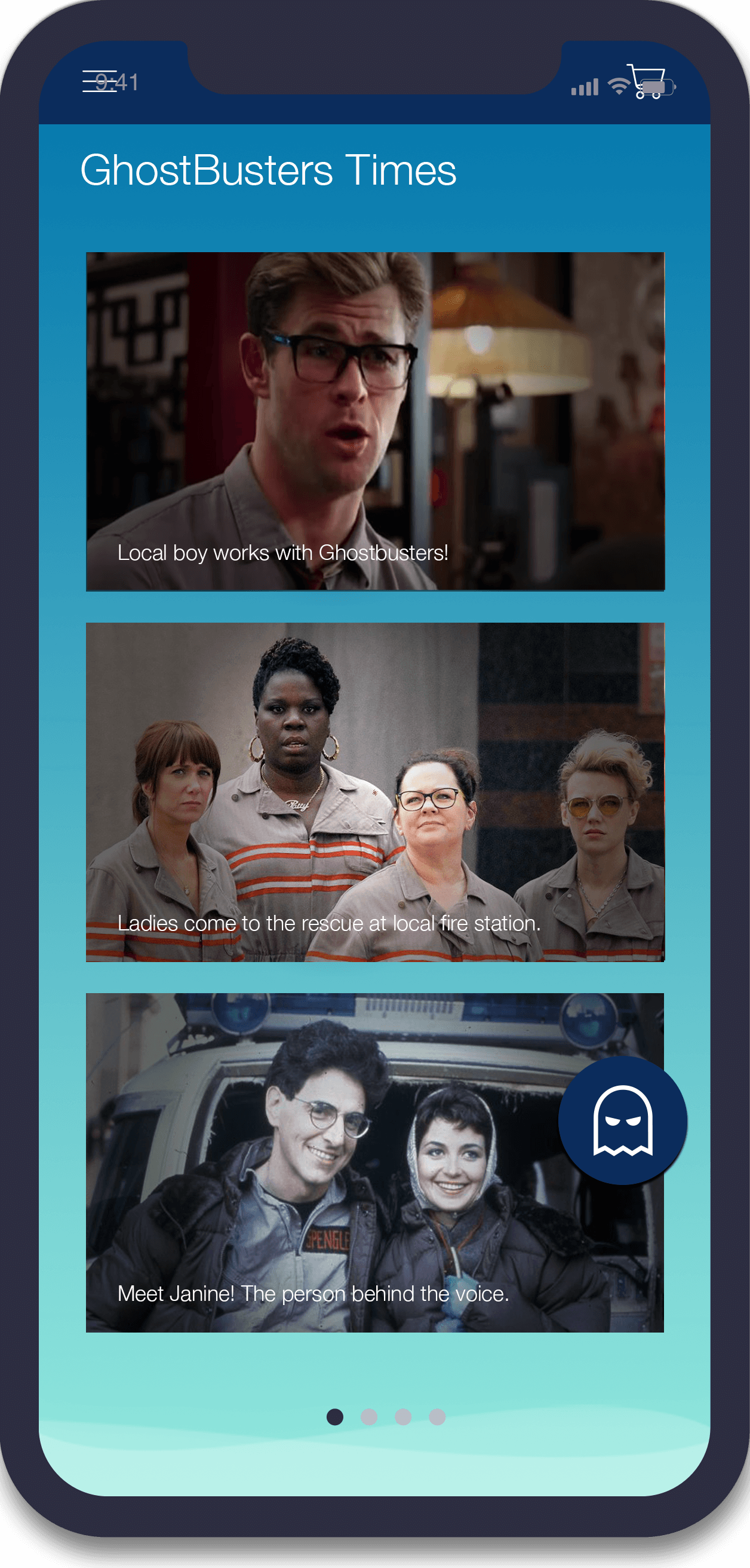

CONCEPT INSPIRATION

User engagement for animation series are reaching new heights. An example was the hit AR App POKEMON GO; which sent fans into a frenzy with it’s unique GPS feature. The beginning of Ghostbustore grew from my curiosity in unique user engagement methods, Augmented Reality has capture people’s imagination and displays it right in front of them.
Through this project, my team and I sought to explore how we can strengthen the bond between fans and anime series. Specifically engaging with characters from Ghostbusters, we executed a human-centric process where we enhanced user’s engagement with characters from the Ghostbusters Universe
DESIGN PRINCIPLE
Adding personality for delightful experience,
Great content placed strategically,
Social interaction with other community members,
Middle ground between old and new ghostbusters
IDEATION
BRAINSTORMING
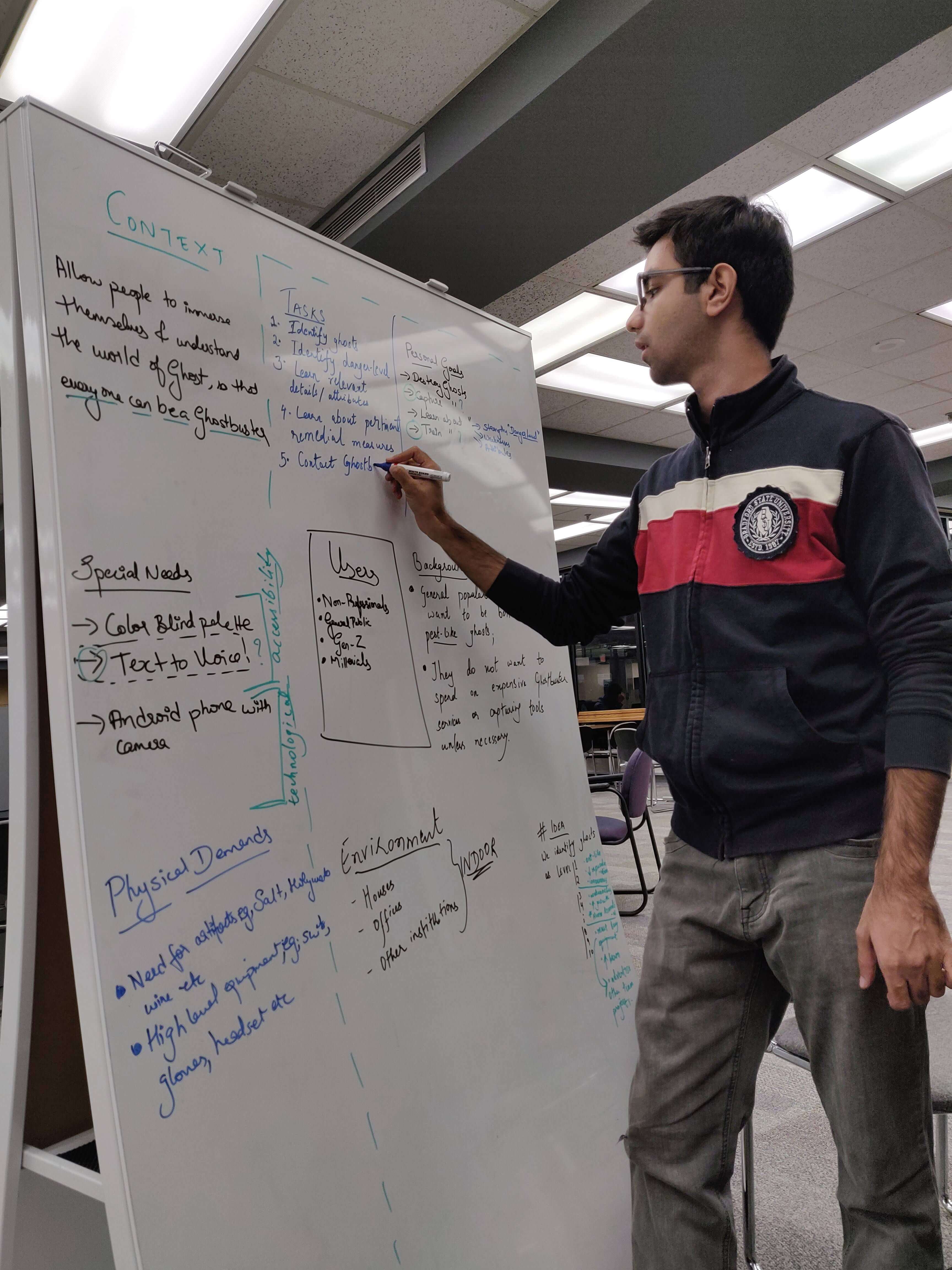

BIG IDEAS
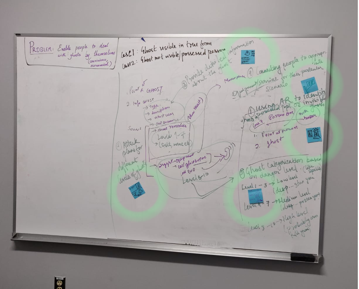
The following ideas were visioned during the brainstorming session:
1. AR for character interaction within the environment
2. Articles pertaining to fictional ghostbuster stories
3. Live location to indicate nearby ghostbuster groups
4. Character UI taken from old and new ghostbuster series
5.Push notifications to remind user about current journey status within Ghostbustore AR.
STORYBOARDING
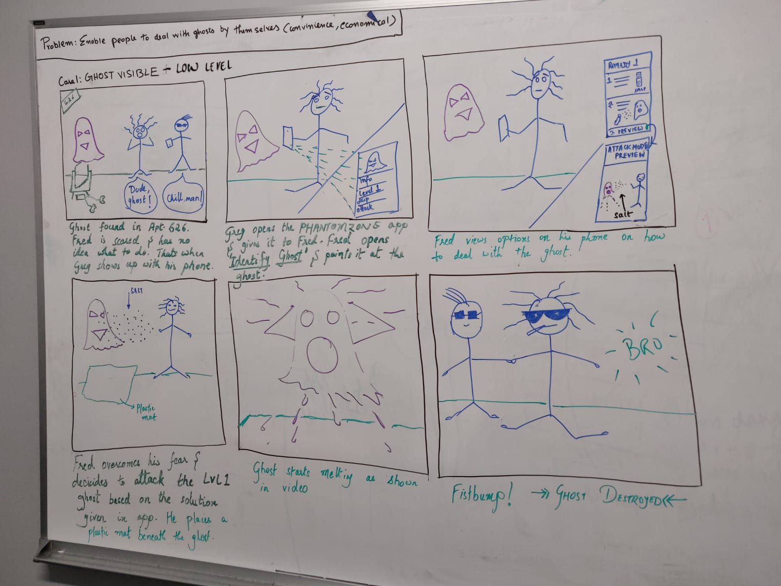
Storyboard #1
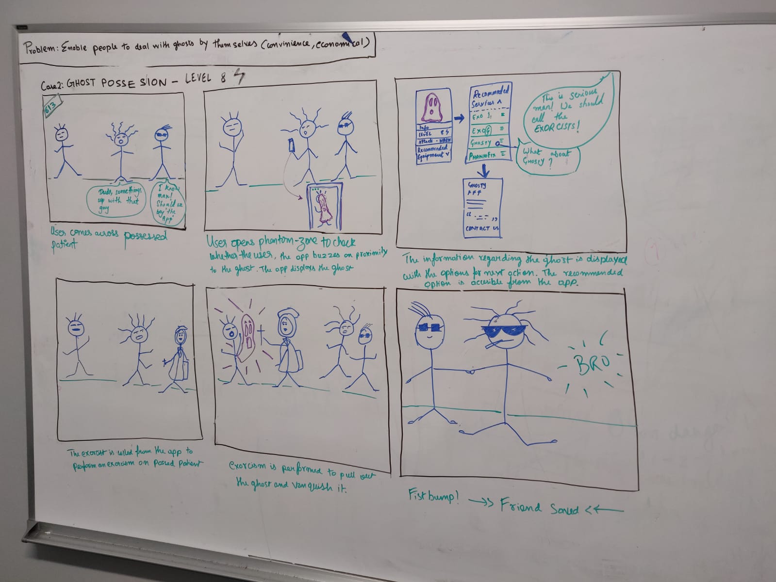
Storyboard #2
App Flow
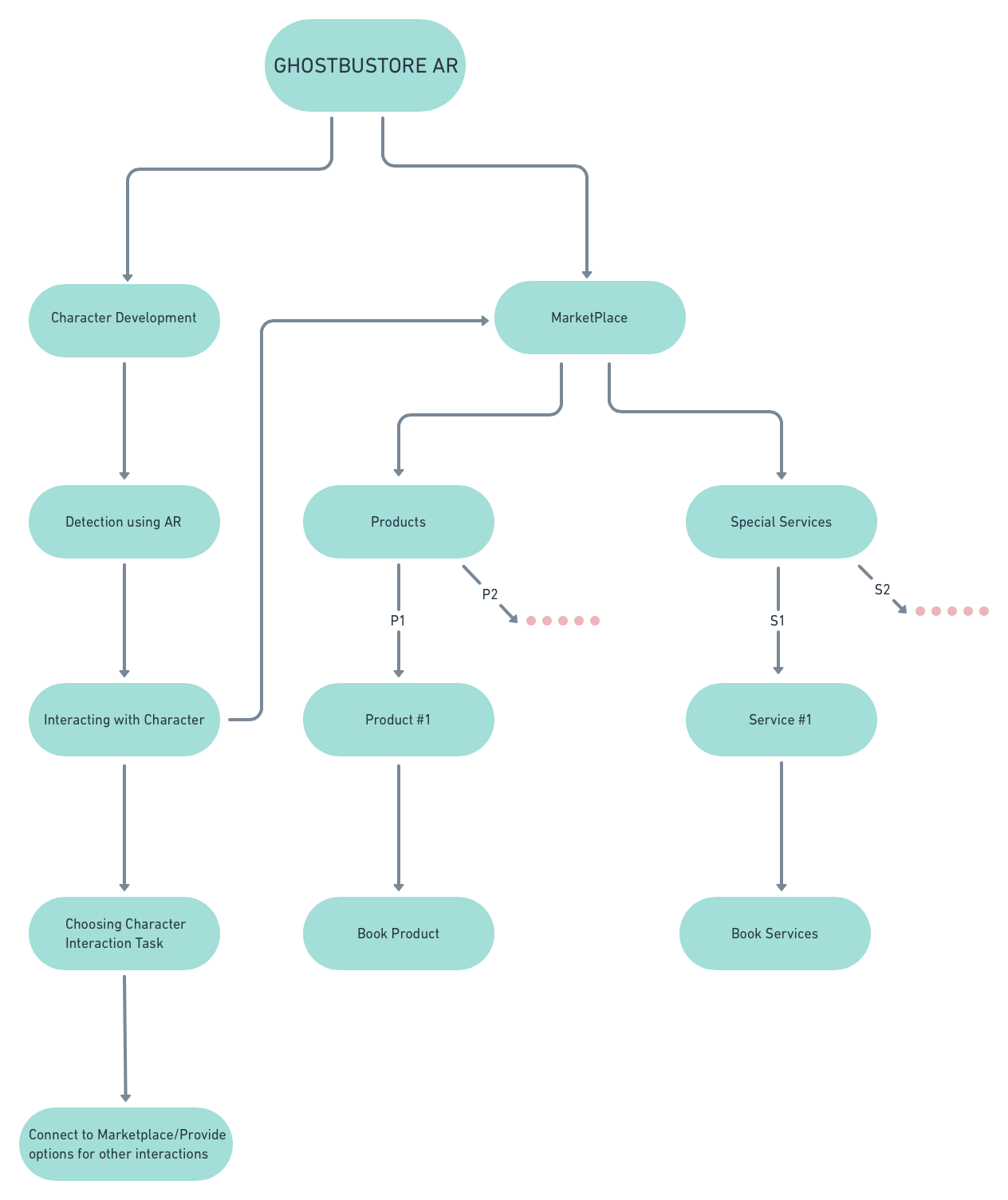
DESIGN
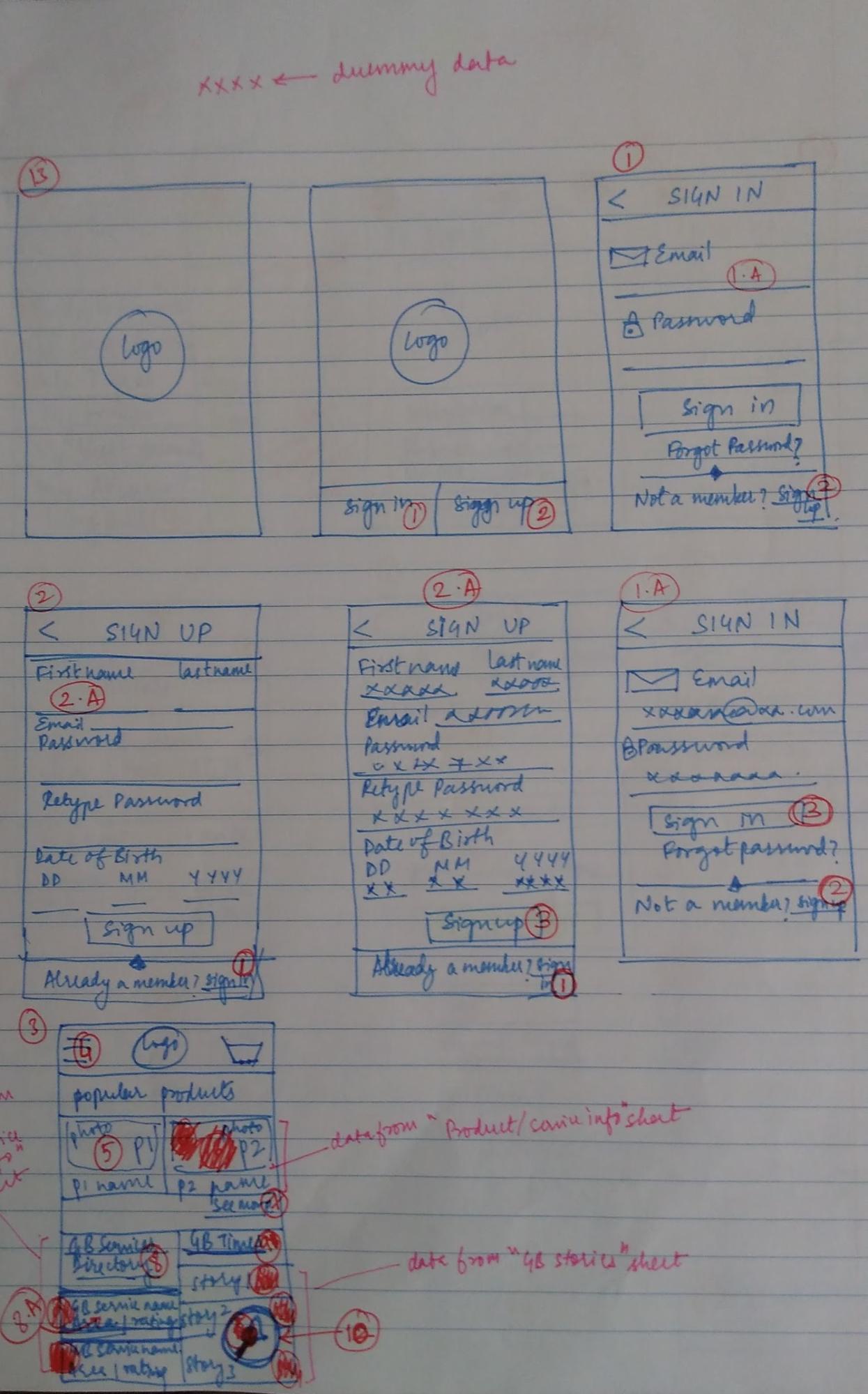
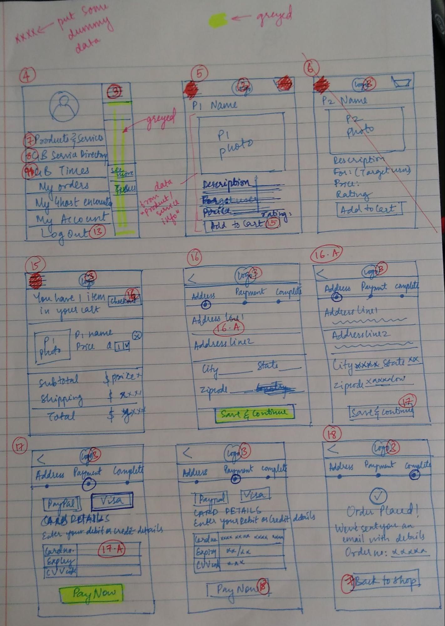
LO-FI WIREFRAMES
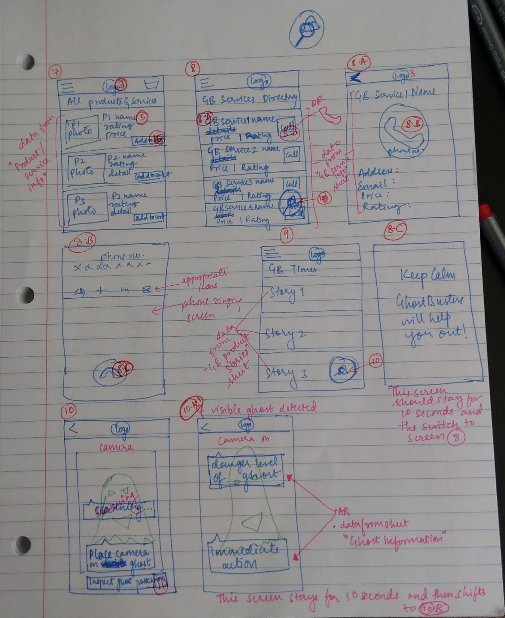
HI-FI WIREFRAMES – VERSION 1
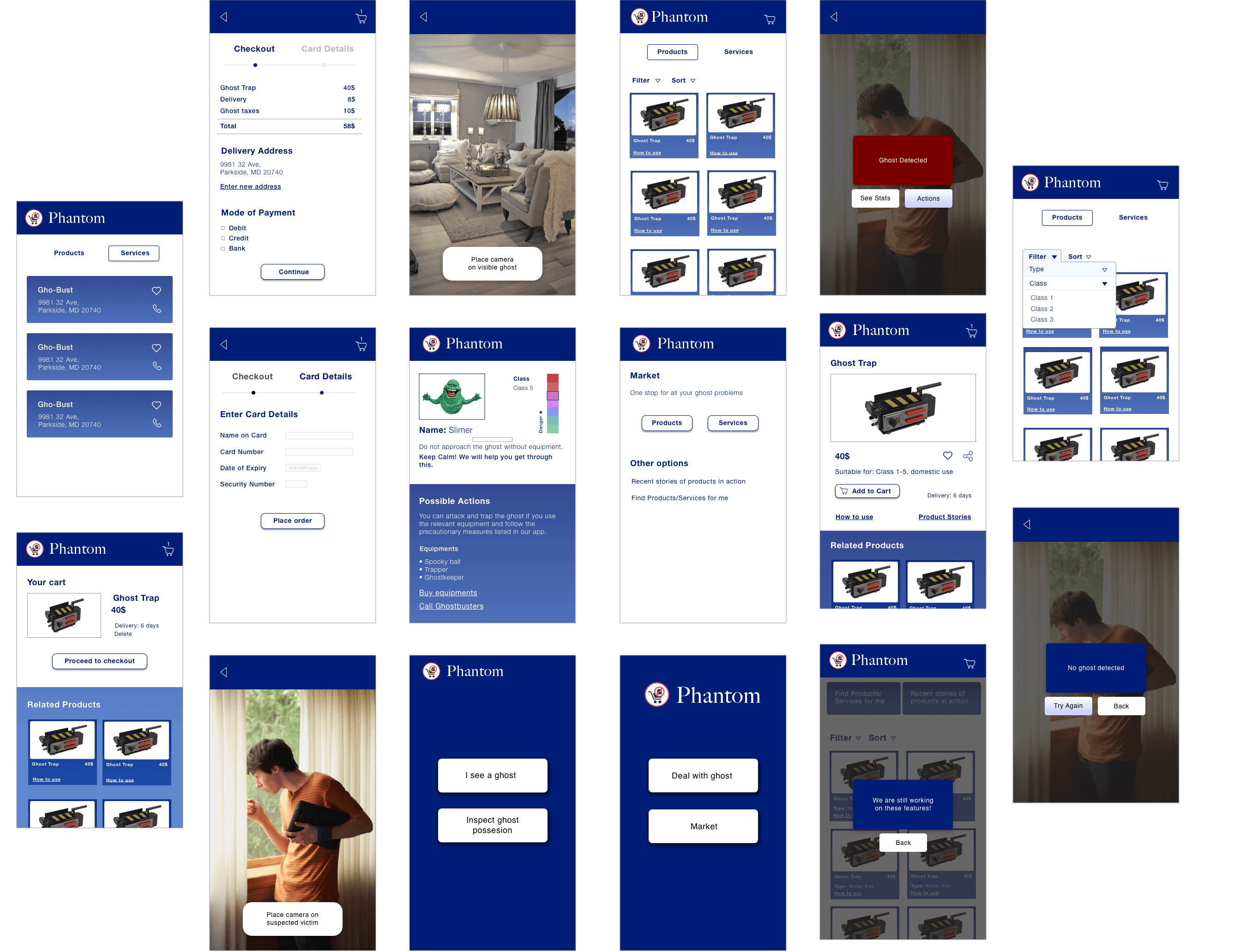
V1 – PROTOTYPE
USER TESTING
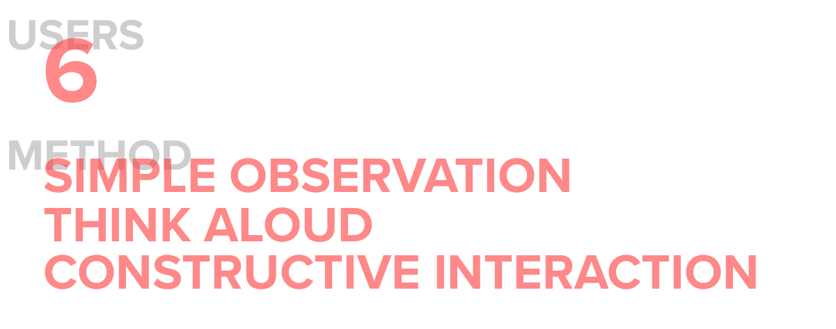
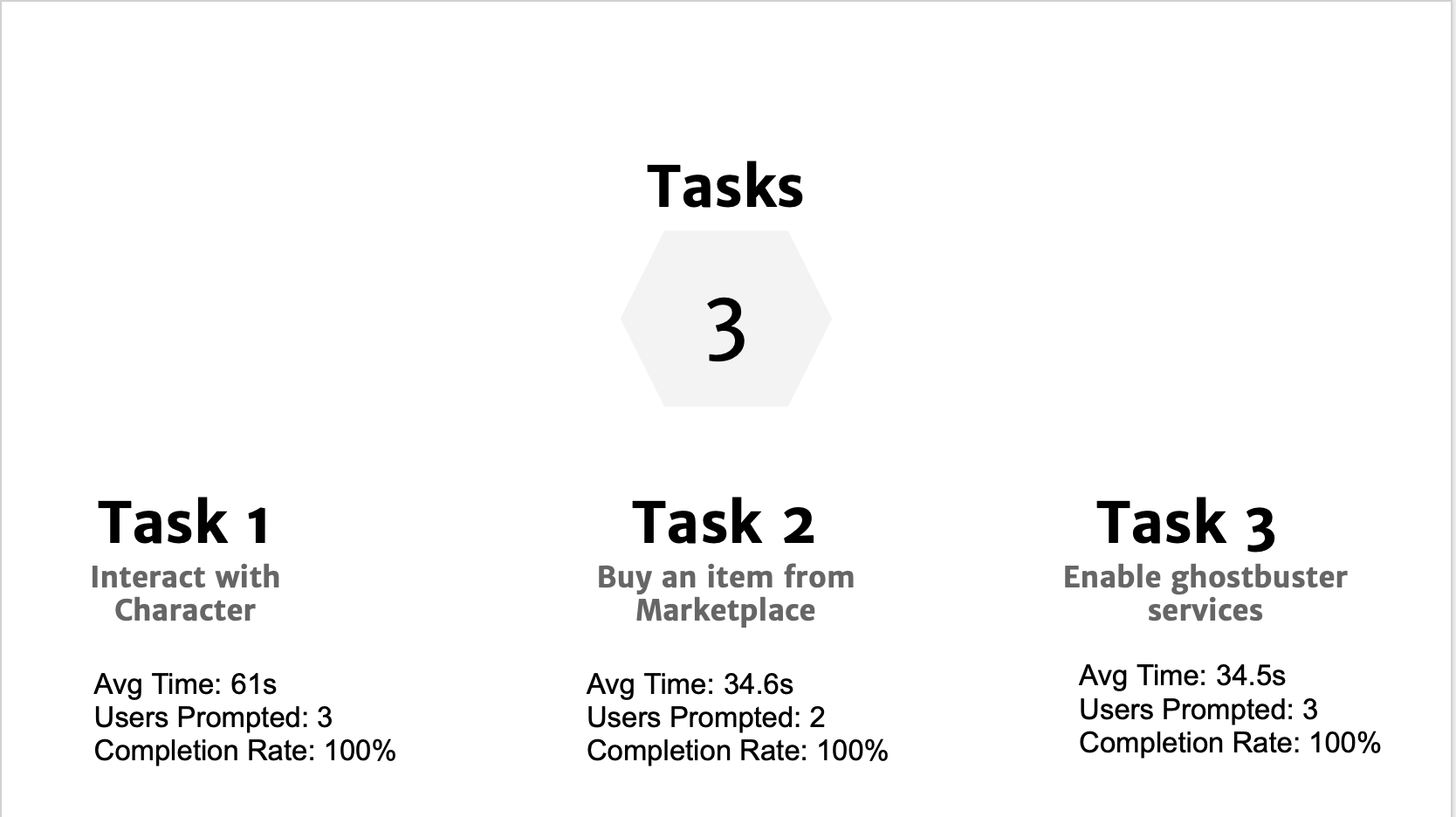
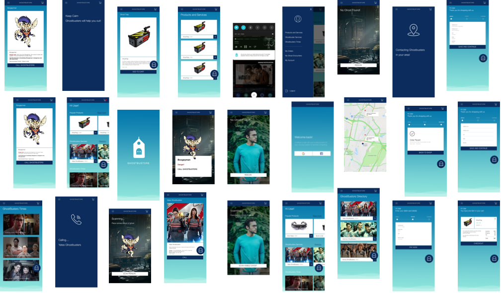
The results from the user tests narrowed down where iterations were necessary, some changes which were recommended was the unification of AR interaction & marketplace, new UI elements and features, separate Logo and many more. Scroll down to see the next stage of iterations.
HI-FI WIREFRAMES – VERSION 2
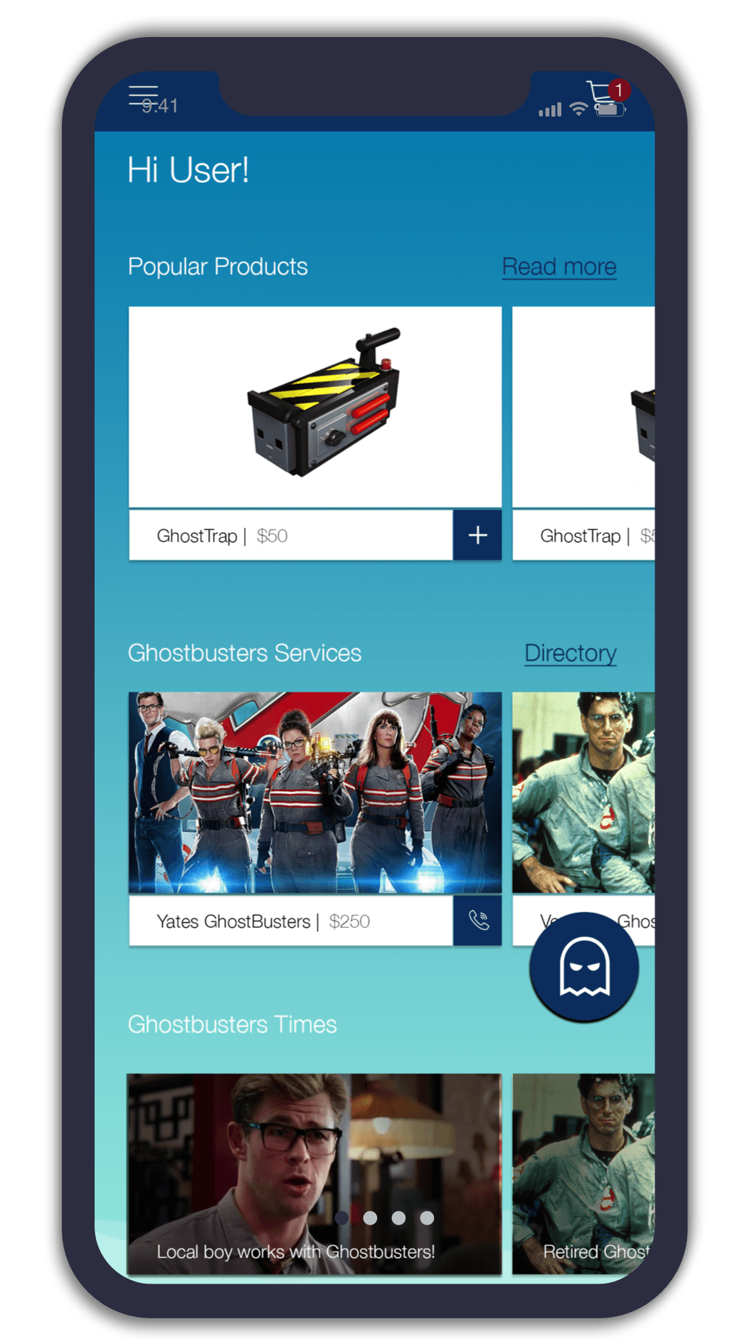
UNIFIED HOME PAGE
SEPARATE SECTIONS
To highlight different application features within singular page
PERSONALIZED SELECTION
Top most section to showcase common user buying trends
INTERACTIVE LITERATURE
Engaging content about current Ghostbuster Themes
COMMUNITY INTERACTION
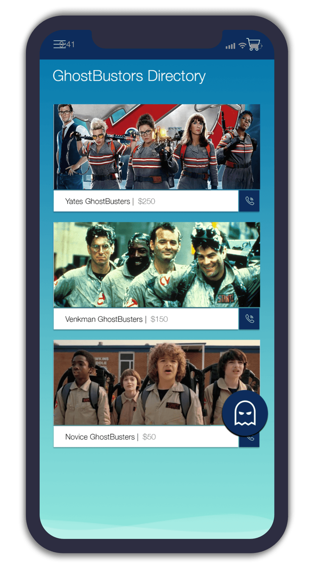
REAL TIME ENGAGEMENT
Real time interaction with experienced/amateur groups
RANKING
To promote competitiveness between groups
ACCESSIBLE FAB
Fast-Switching into AR Environment
PUSH NOTIFICATIONS
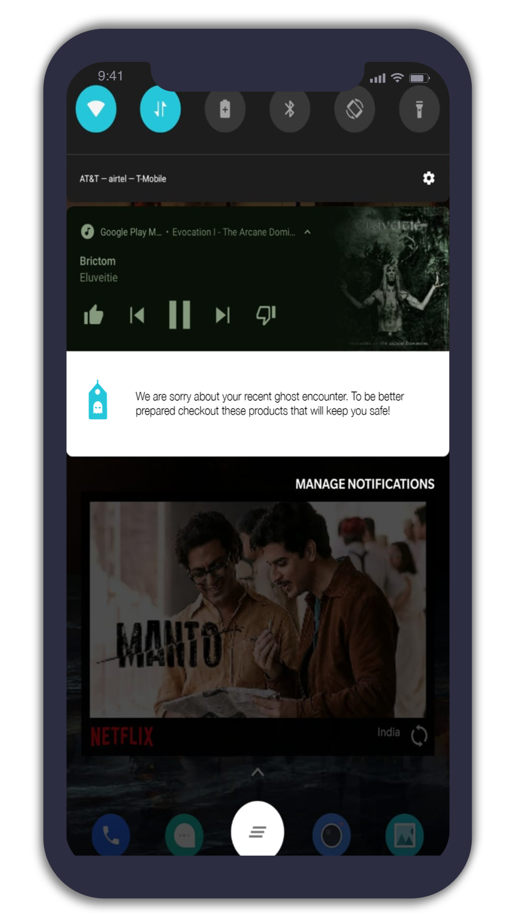
NOTIFICATION LISTS
Notification formatted into lists with important information to facilitate action
GREAT USP
User engagement beyond mobile application using key information metrics
LOGO

BEFORE

AFTER
SIMPLE
Price Tag design provides similarity to the marketplace concept
UI DESIGN

FRIENDLY
Light notes with various hues to promote clean look
HIERARCHY
Visual hierarchy established through type, volume, shadow and text-oriented
SIDE NAVIGATION
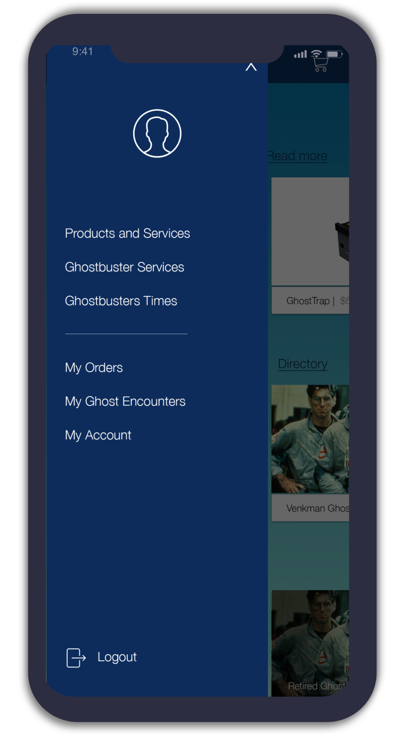
ACCESSIBLE SIDEBAR
One-Click step for relevant in-game features
SEGREGATED SECTIONS
Clear indication between Account details and in-game features
LARGER SCREEN SPACE
Larger screen space to enhance AR immersion
AUGMENTED REALITY
PLAY WITH PROTOTYPE
LEARNINGS
Visual Design is a game-changer!
Variation of color and UI placement are vital for subtle triggers within the application, it showcases it’s important in branding too.
Keep It Simple Stupid (K.I.S.S)
Simple UI designs and simple flows work, it’s important not to burden the user. The updated streamlined user flows proved to be intuitive and users had fewer problems when using the application.
User Research is important.
If I would go back, I would have invested some time in interviewing users and analyze their trends around community engagement application. The insights that I would have gotten would have improved the user experience of the application.
Augmented Reality enhances UX
AR proved to be a hit as everyone was keen on using to interact with characters within their environment, it really immerses the users within the experience.
